


MCR 2-Page Spread
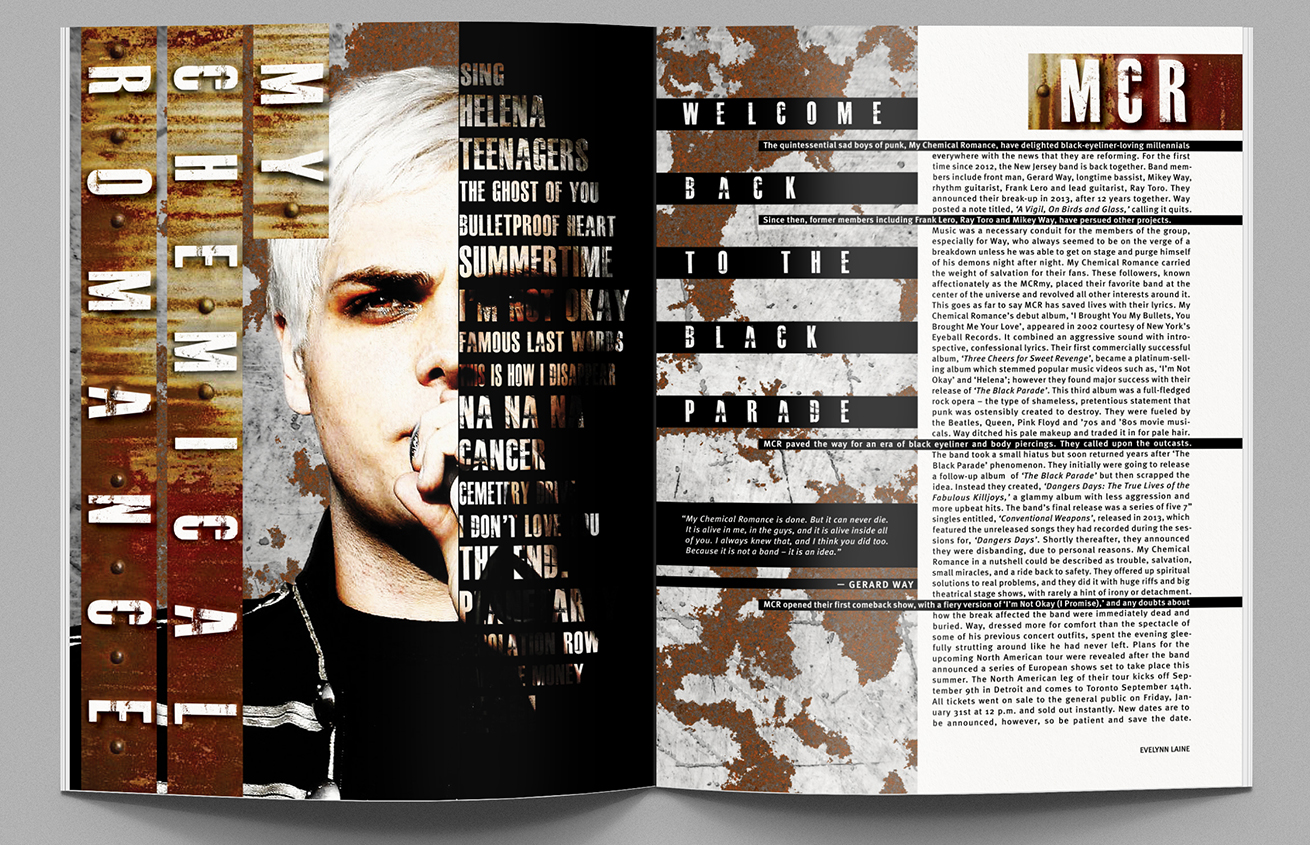
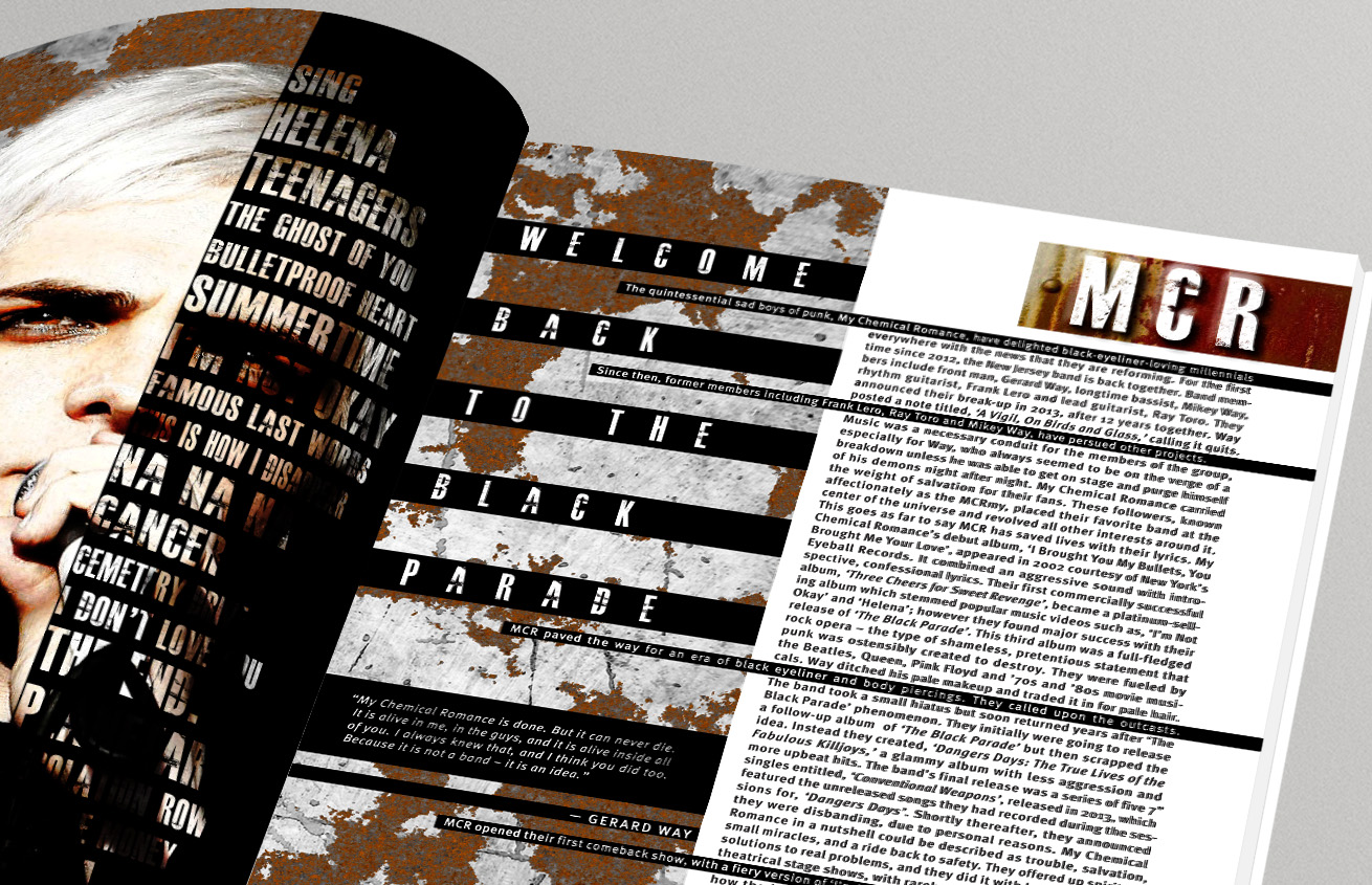
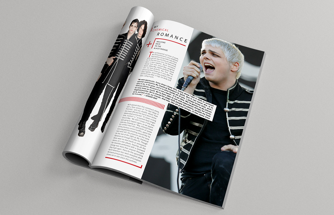
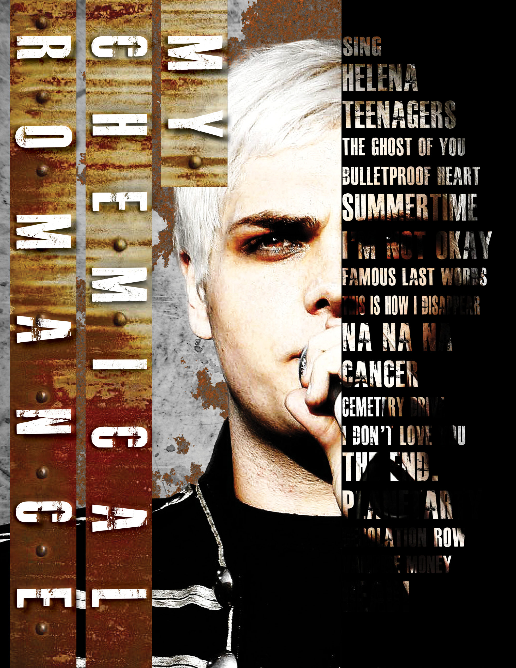
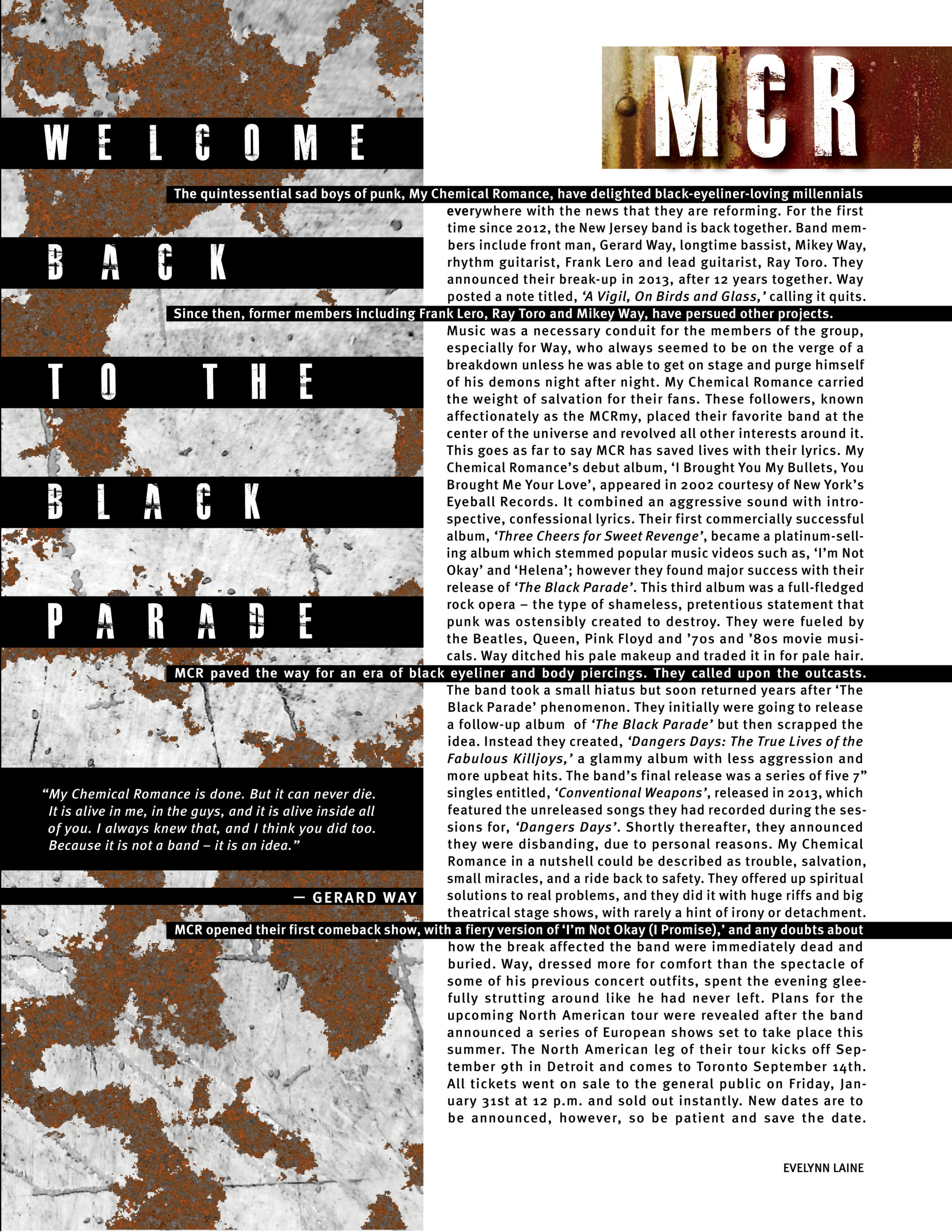
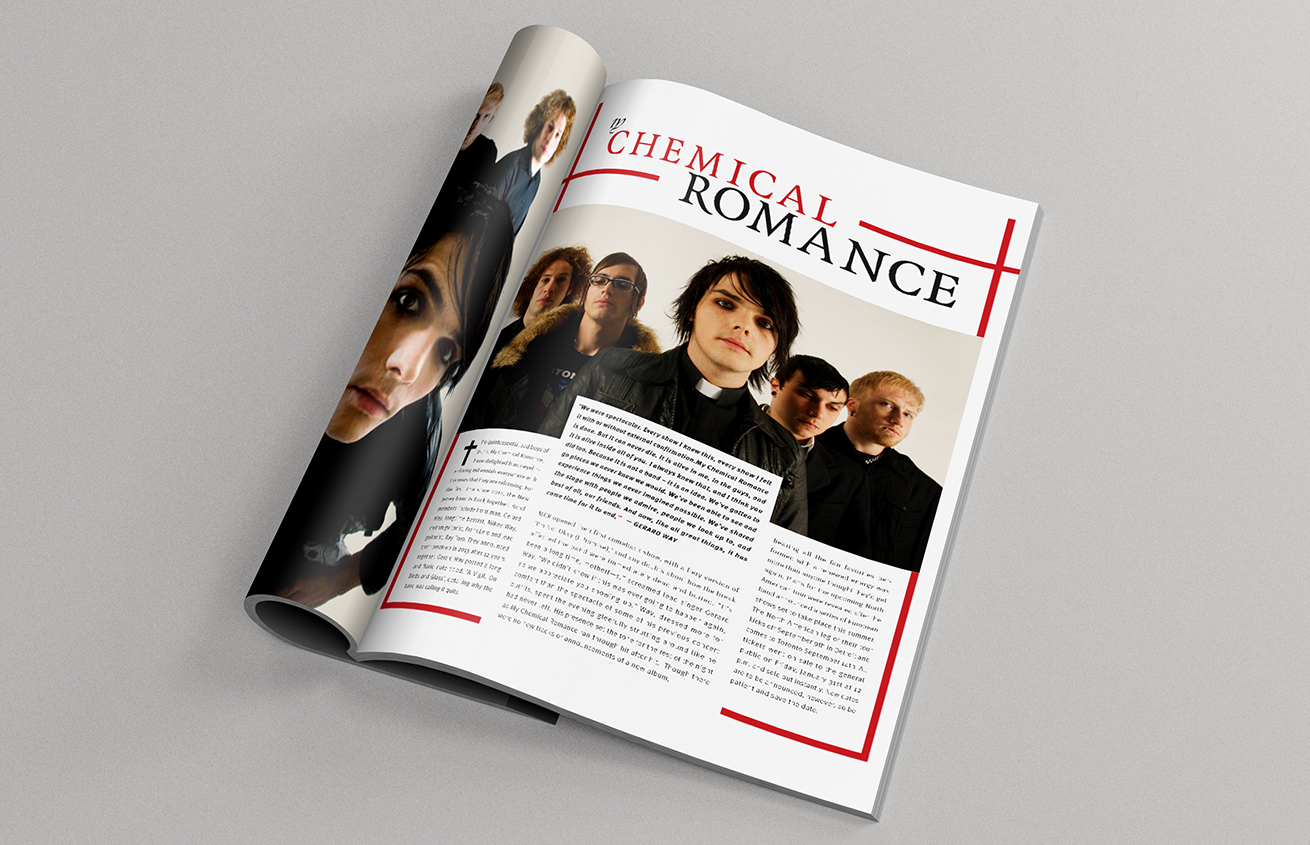
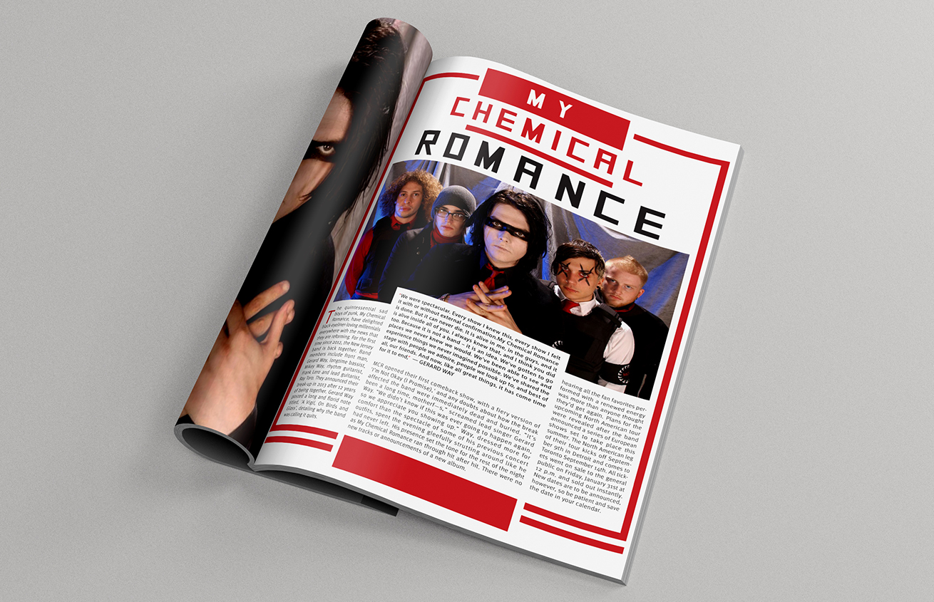
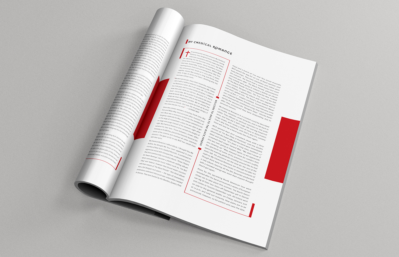
This 2-page spread is an article advertising the comeback tour of My Chemical Romance. My objective was to integrate a typographic system whether it was axial, radial or dilatation; I chose to apply the axial system to the main body text and the typographic art covering the lead singer’s portrait. Before attempting the final spread, I practiced several typographic systems in one-page spreads.


Outcome
My Chemical Romance is an emo-rock band, in response I used rustic and scratchy imagery to evoke their rough and deathly sound. I relied on black rules and paragraph indents to give the article shape and contrast. My challenge was trying to find harmony across the two pages. My solution was to carry through the heavy contrast and sharp geometric shapes. The portrait was also touched-up.





MCR 2-Page Spread
This 2-page spread is an article advertising the comeback tour of My Chemical Romance. My objective was to integrate a typographic system whether it was axial, radial or dilatation; I chose to apply the axial system to the main body text and the typographic art covering the lead singer’s portrait. Before attempting the final spread, I practiced several typographic systems in one-page spreads.

Outcome
My Chemical Romance is an emo-rock band, in response I used rustic and scratchy imagery to evoke their rough and deathly sound. I relied on black rules and paragraph indents to give the article shape and contrast. My challenge was trying to find harmony across the two pages. My solution was to carry through the heavy contrast and sharp geometric shapes. The portrait was also touched-up.
Draft Spreads
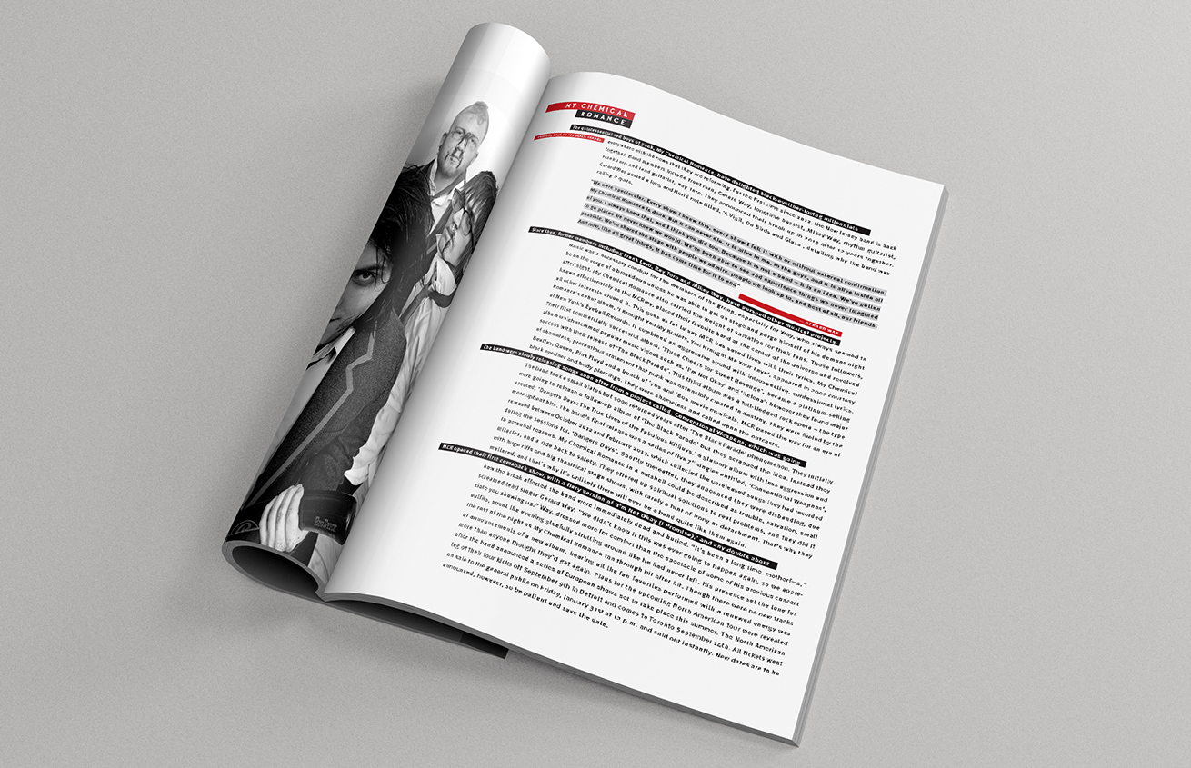
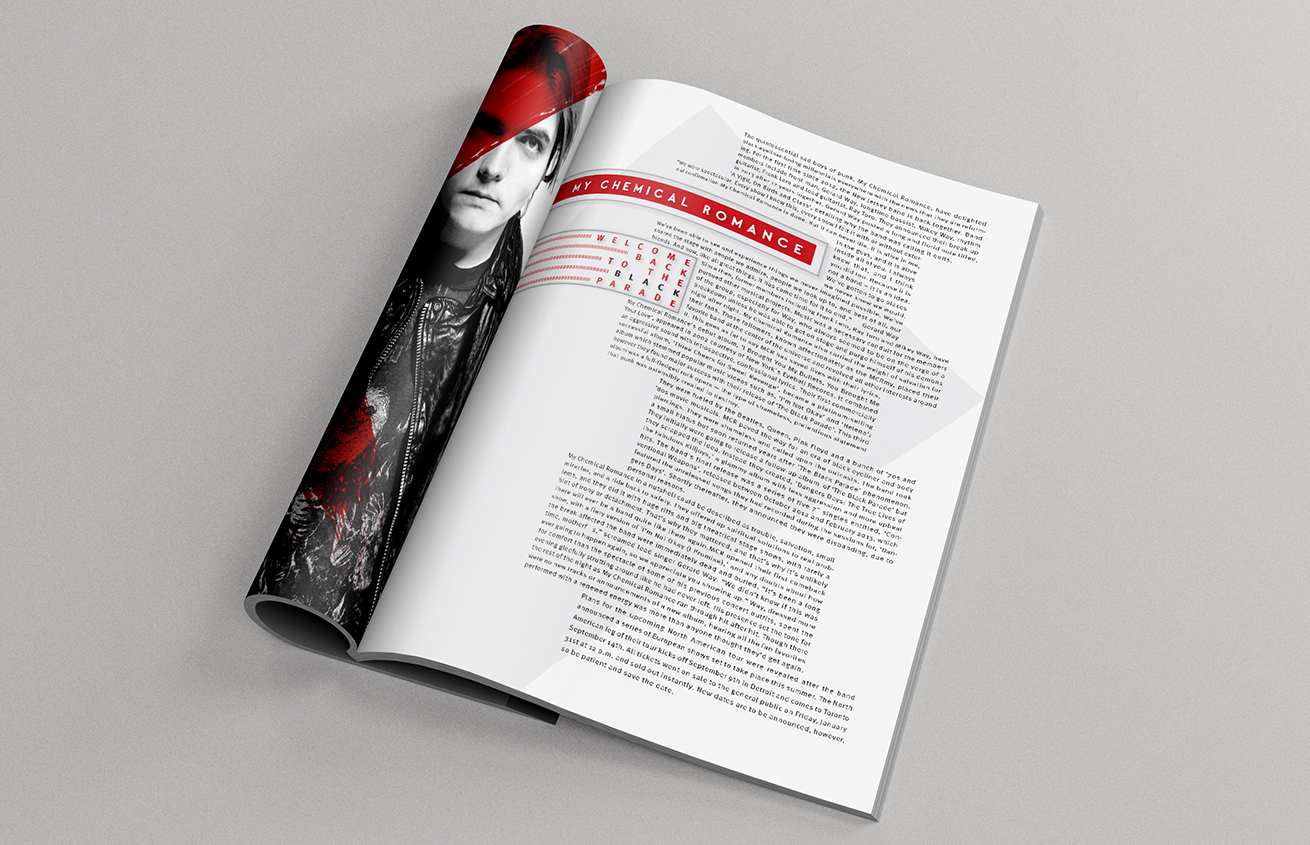
Axial Exploration
Dilatation Exploration
Radial Exploration
Random Exploration


MCR 2-Page Spread
This 2-page spread is an article advertising the comeback tour of My Chemical Romance. My objective was to integrate a typographic system whether it was axial, radial or dilatation; I chose to apply the axial system to the main body text and the typographic art covering the lead singer’s portrait. Before attempting the final spread, I practiced several typographic systems in one-page spreads.


Outcome
My Chemical Romance is an emo-rock band, in response I used rustic and scratchy imagery to evoke their rough and deathly sound. I relied on black rules and paragraph indents to give the article shape and contrast. My challenge was trying to find harmony across the two pages. My solution was to carry through the heavy contrast and sharp geometric shapes. The portrait was also touched-up.

