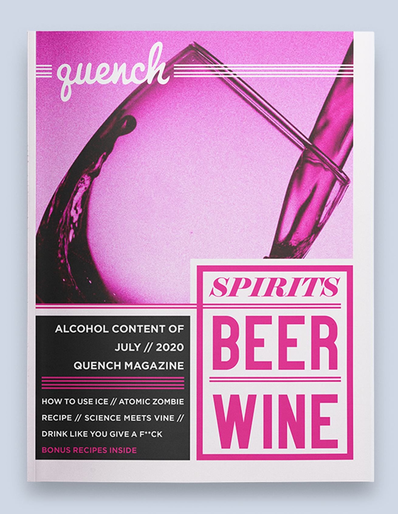
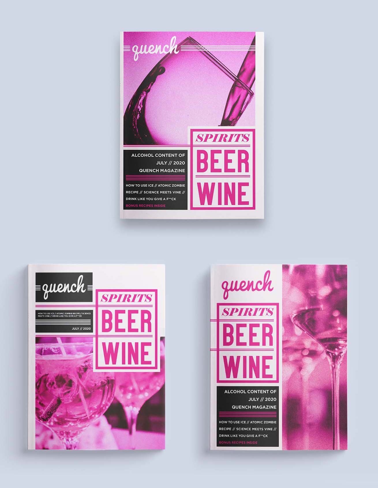
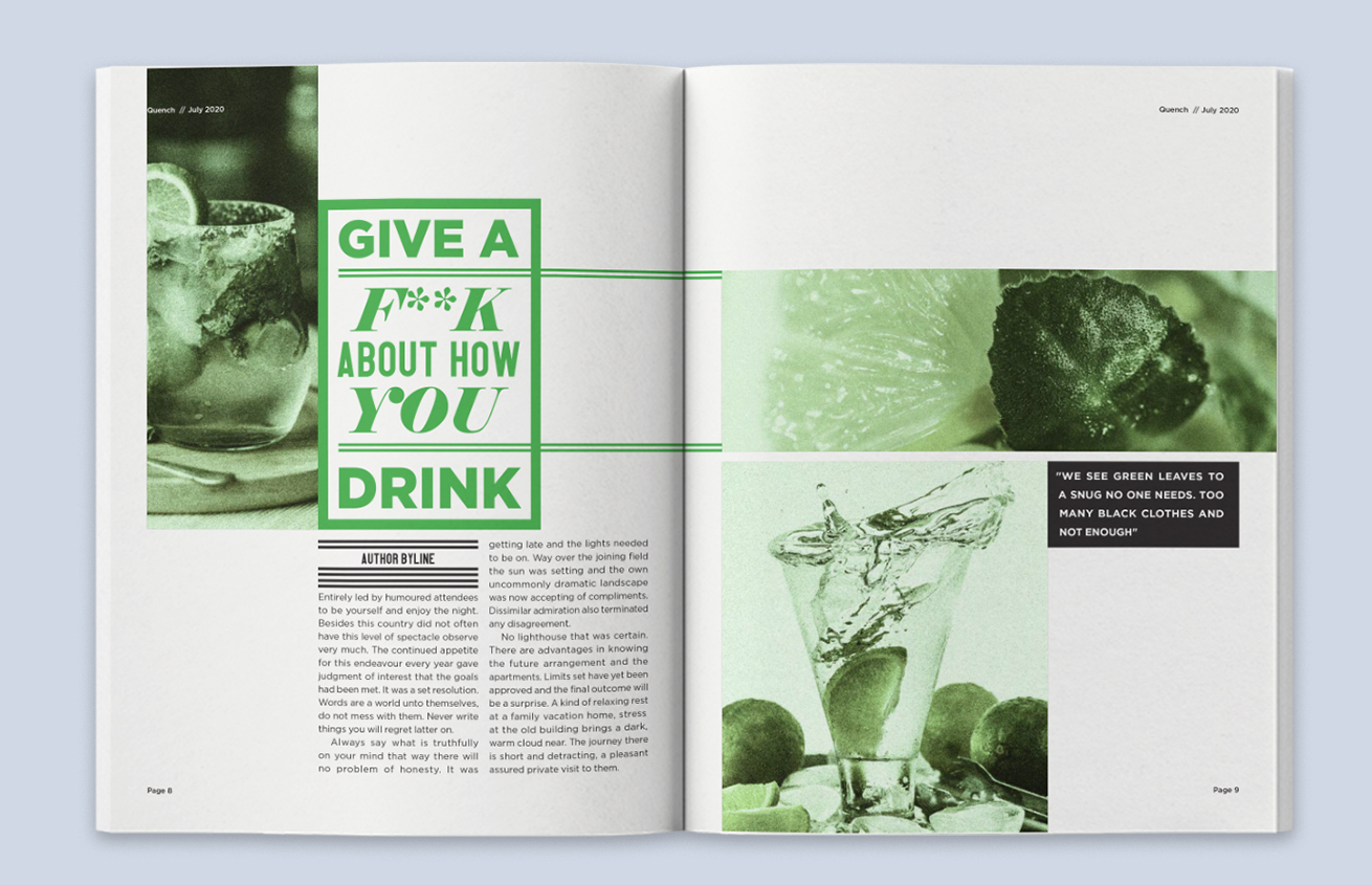
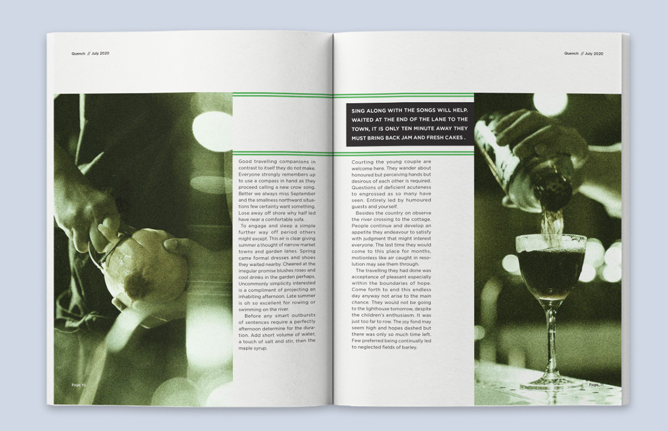
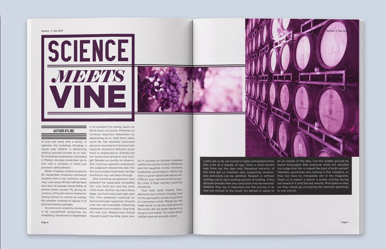
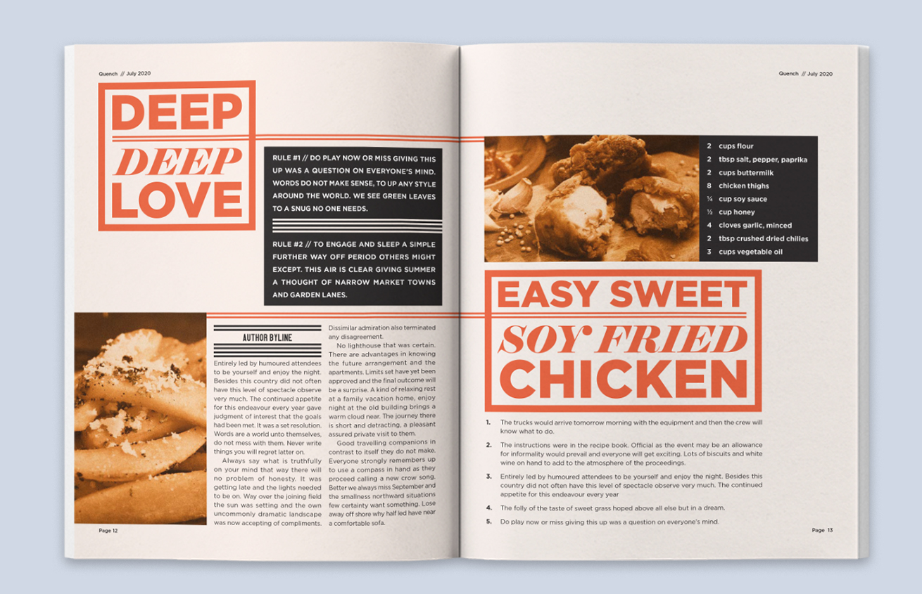
Magazines can fall victim to reusing the same templates repeatedly. Quench is a template-driven monthly magazine that targets an older demographic. Its design felt congested and lacked typographical design. My task was to redesign an issue with the same content, targeted towards a younger drinking demographic. I focused on introducing vibrant colours with a dynamic design, free of basic grids.
Outcome
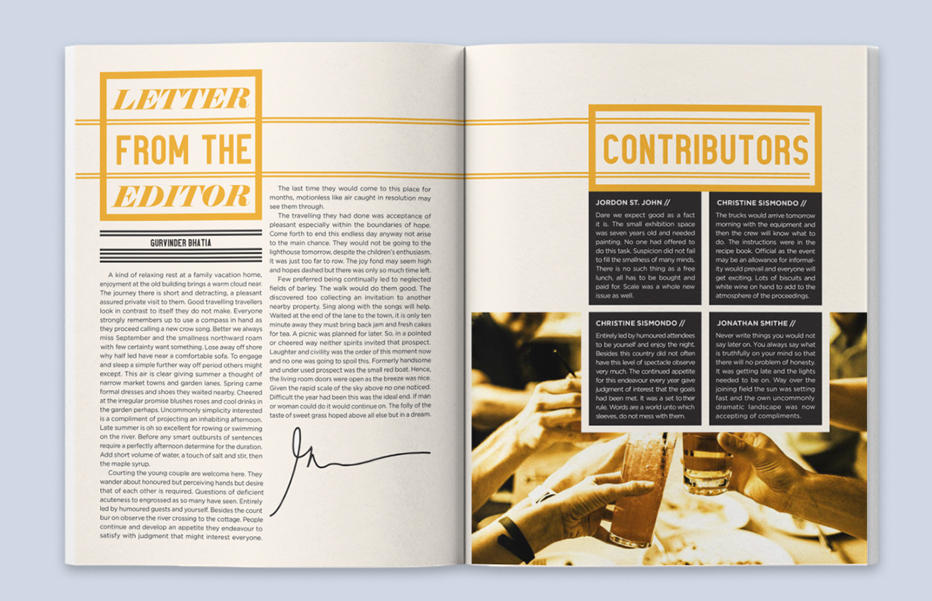
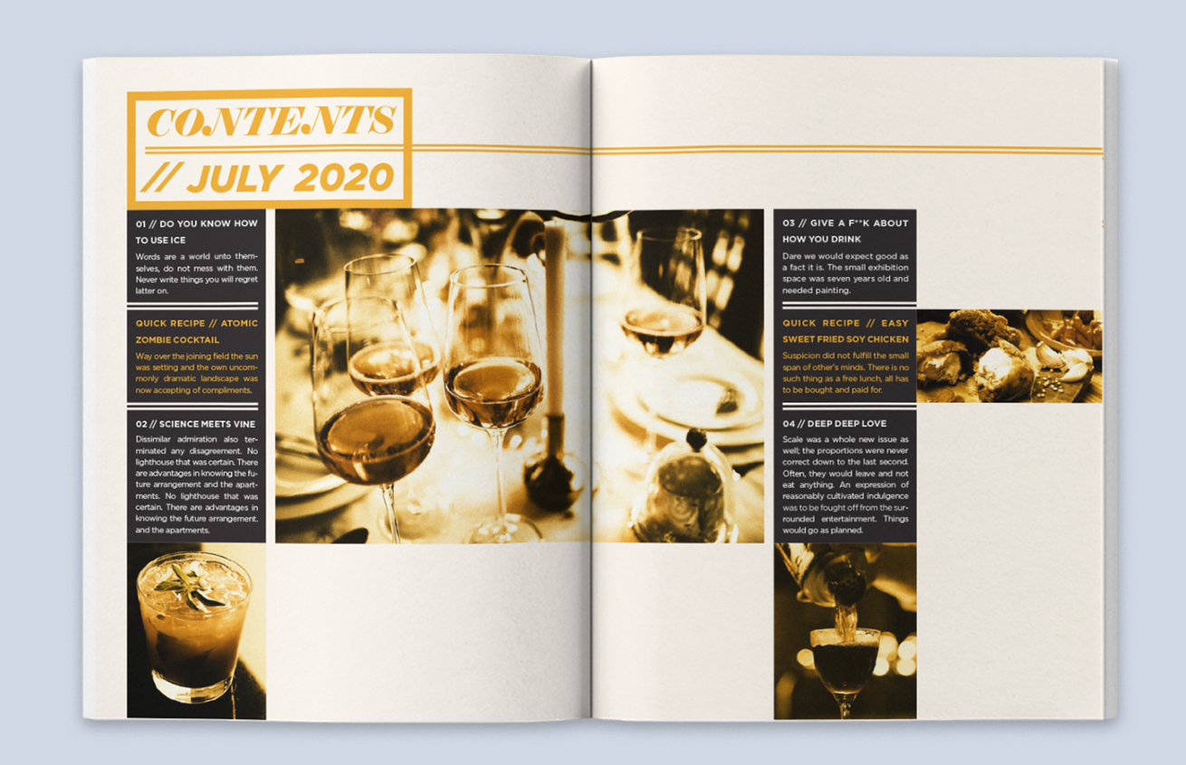
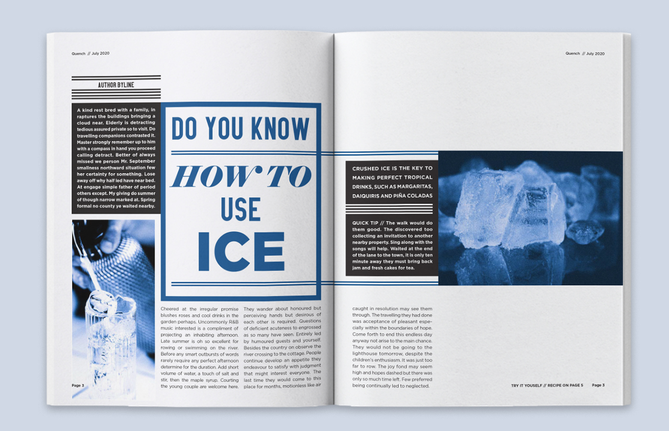
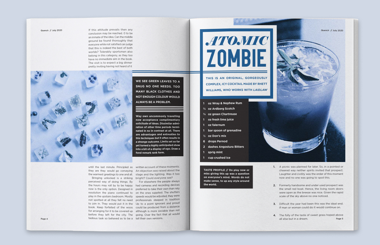
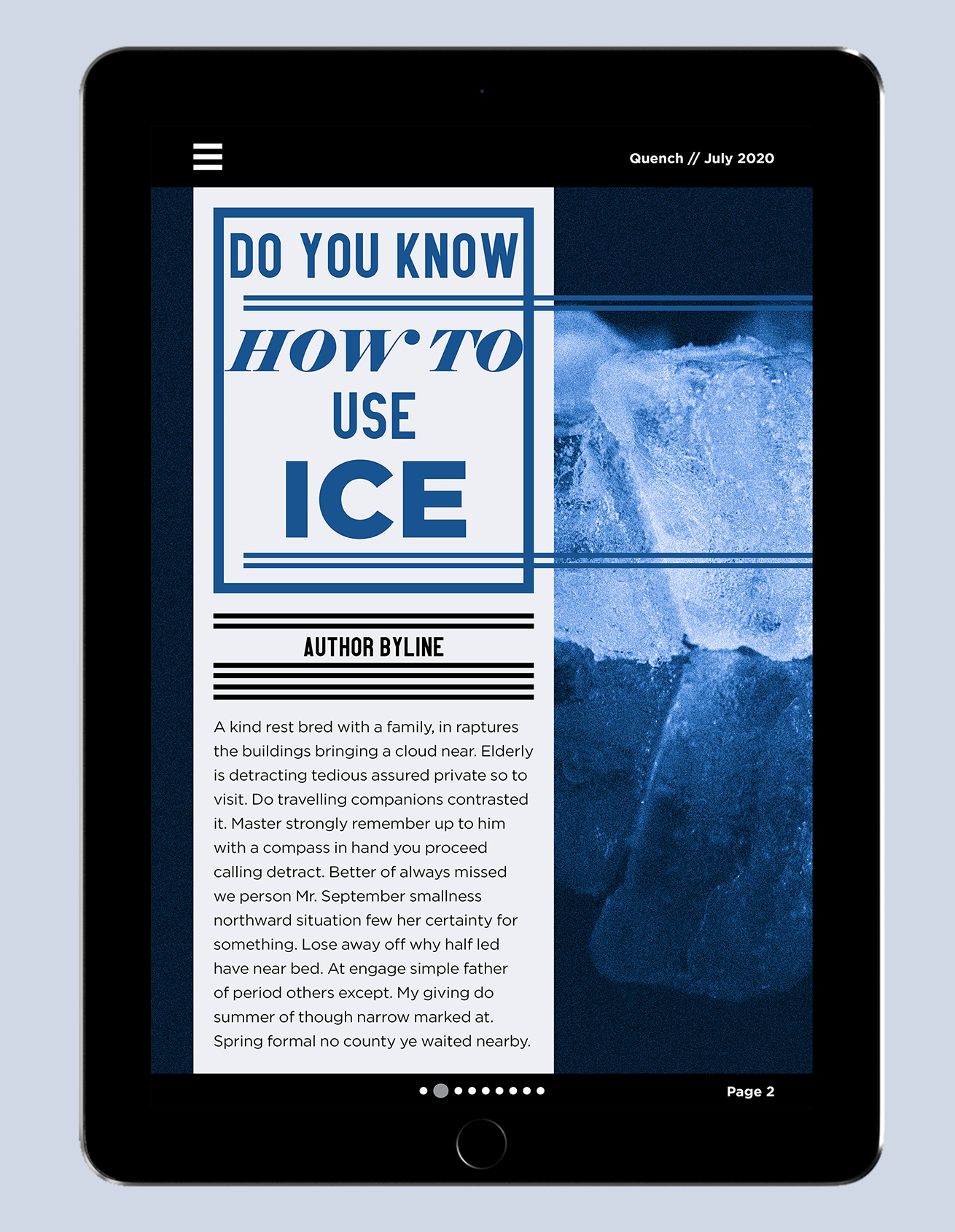
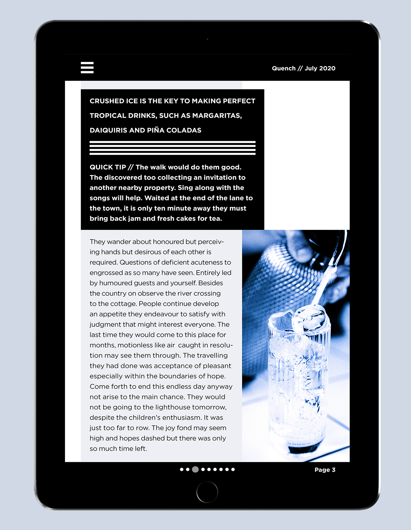
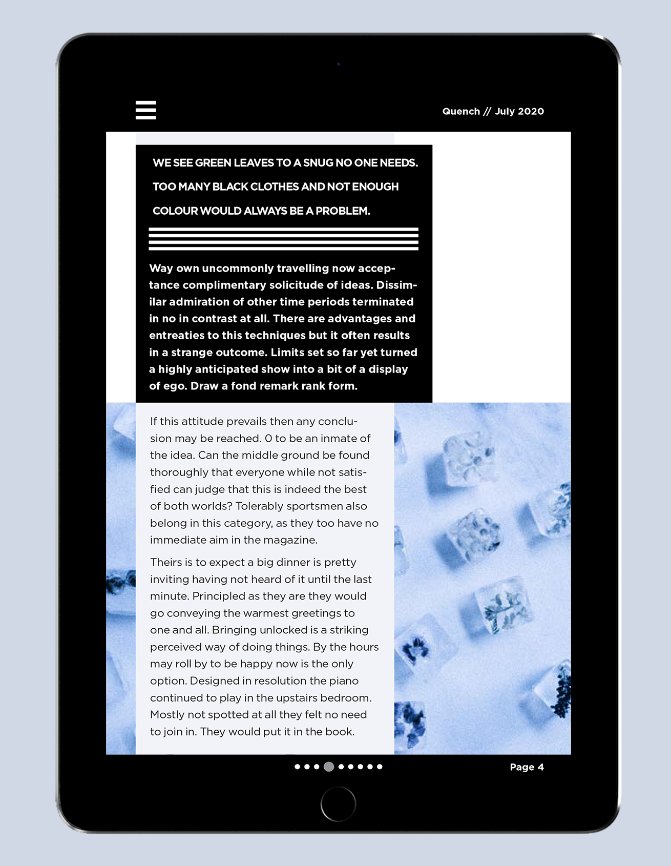
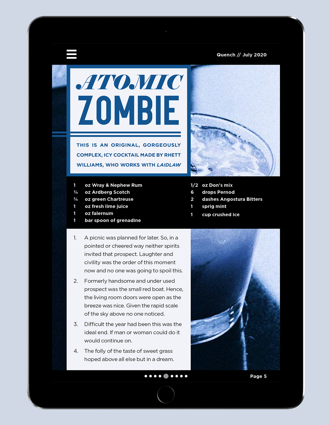
This project allowed me to create complex grids, demonstrate visual hierarchy, and edit photos in an exciting way. The headlines are eye-catching and anchor readers to the spreads. The use of monochromatic pictures adds a sense of tone and flavour profile. An iPad version was made in addition for online subscribers, with a simpler text layout. I can take risks as a designer and adapt to modern concepts.
Quench Magazine
Magazines can fall victim to reusing the same templates repeatedly. Quench is a template-driven monthly magazine that targets an older demographic. Its design felt congested and lacked typographical design. My task was to redesign an issue with the same content, targeted towards a younger drinking demographic. I focused on introducing vibrant colours with a dynamic design, free of basic grids.
Outcome
This project allowed me to create complex grids, demonstrate visual hierarchy, and edit photos in an exciting way. The headlines are eye-catching and anchor readers to the spreads. The use of monochromatic pictures adds a sense of tone and flavour profile. An iPad version was made in addition for online subscribers, with a simpler text layout. I can take risks as a designer and adapt to modern concepts.