



Lockpoint Park
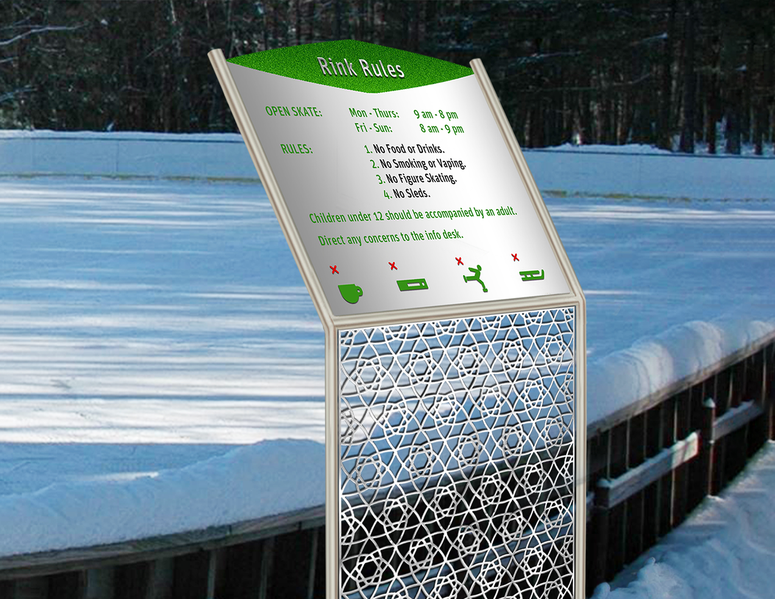
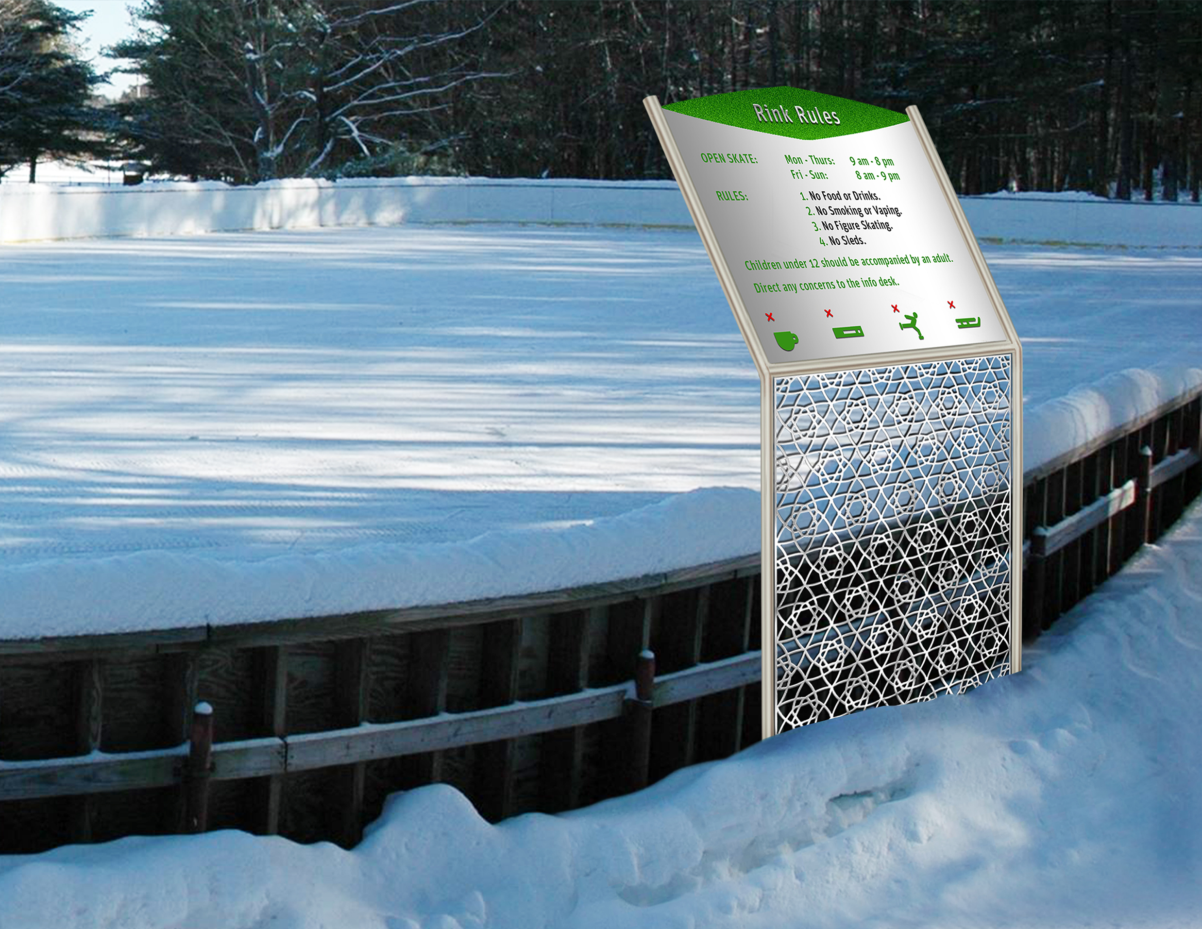
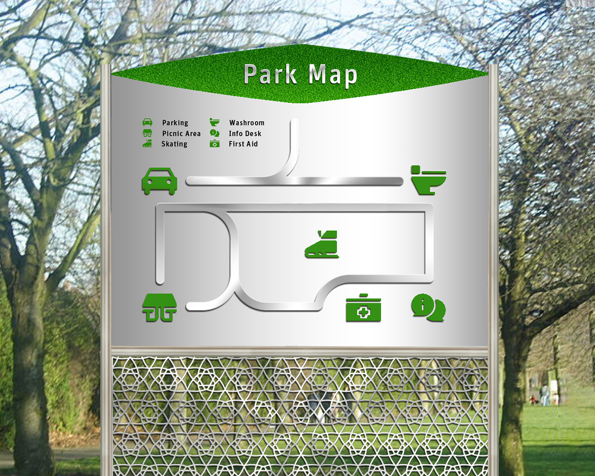
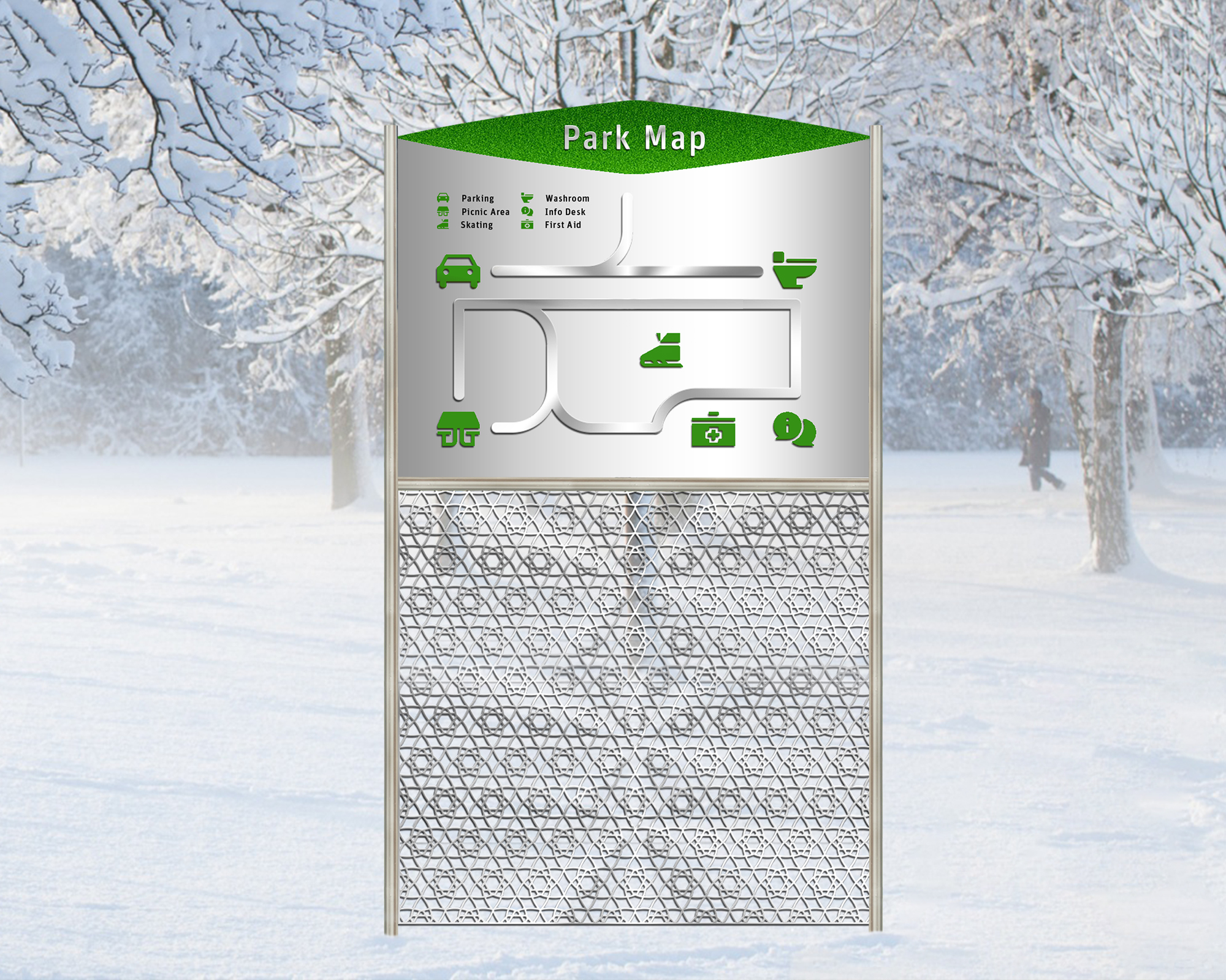
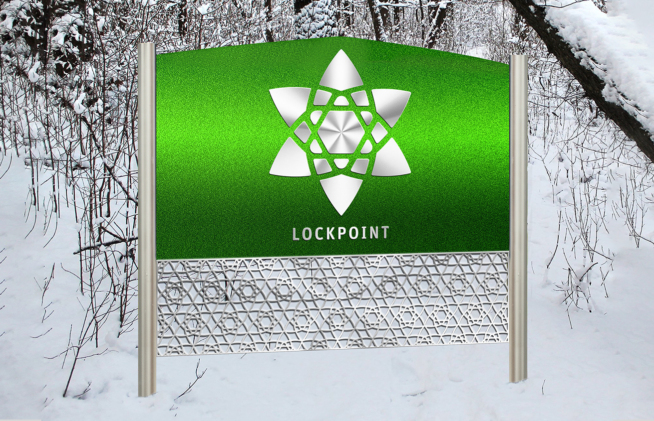
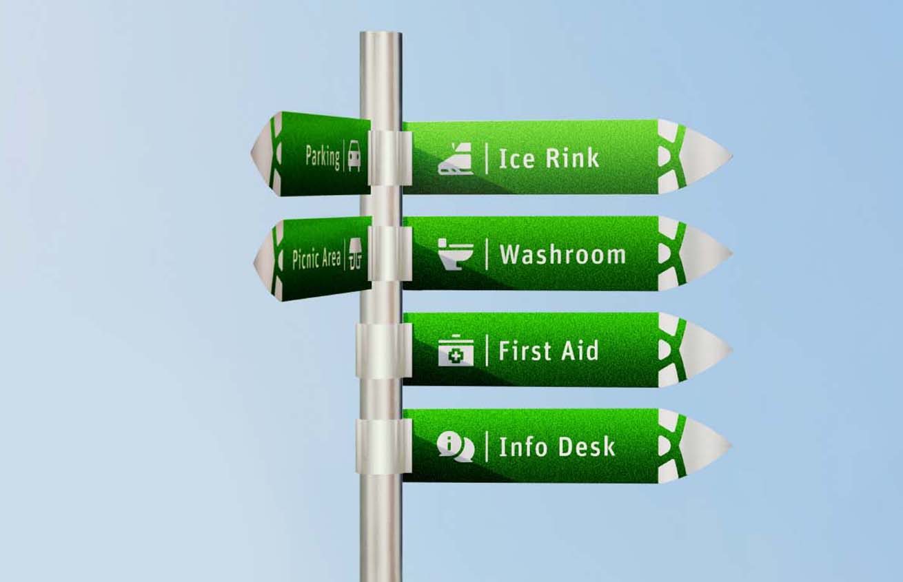
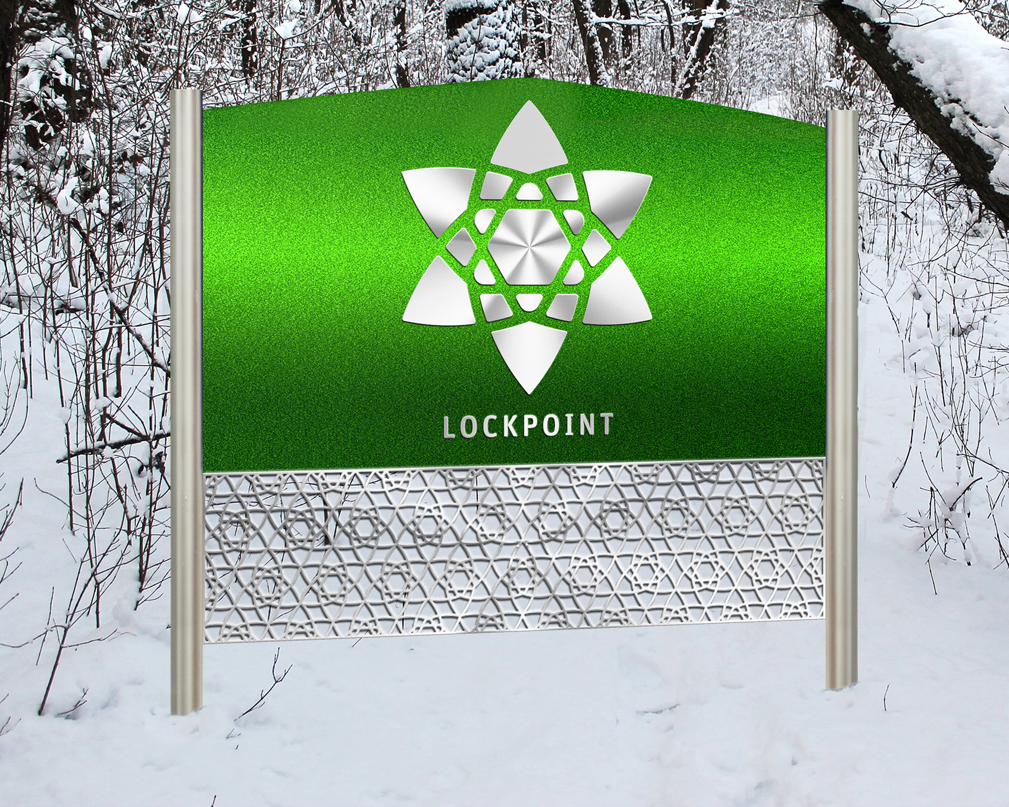
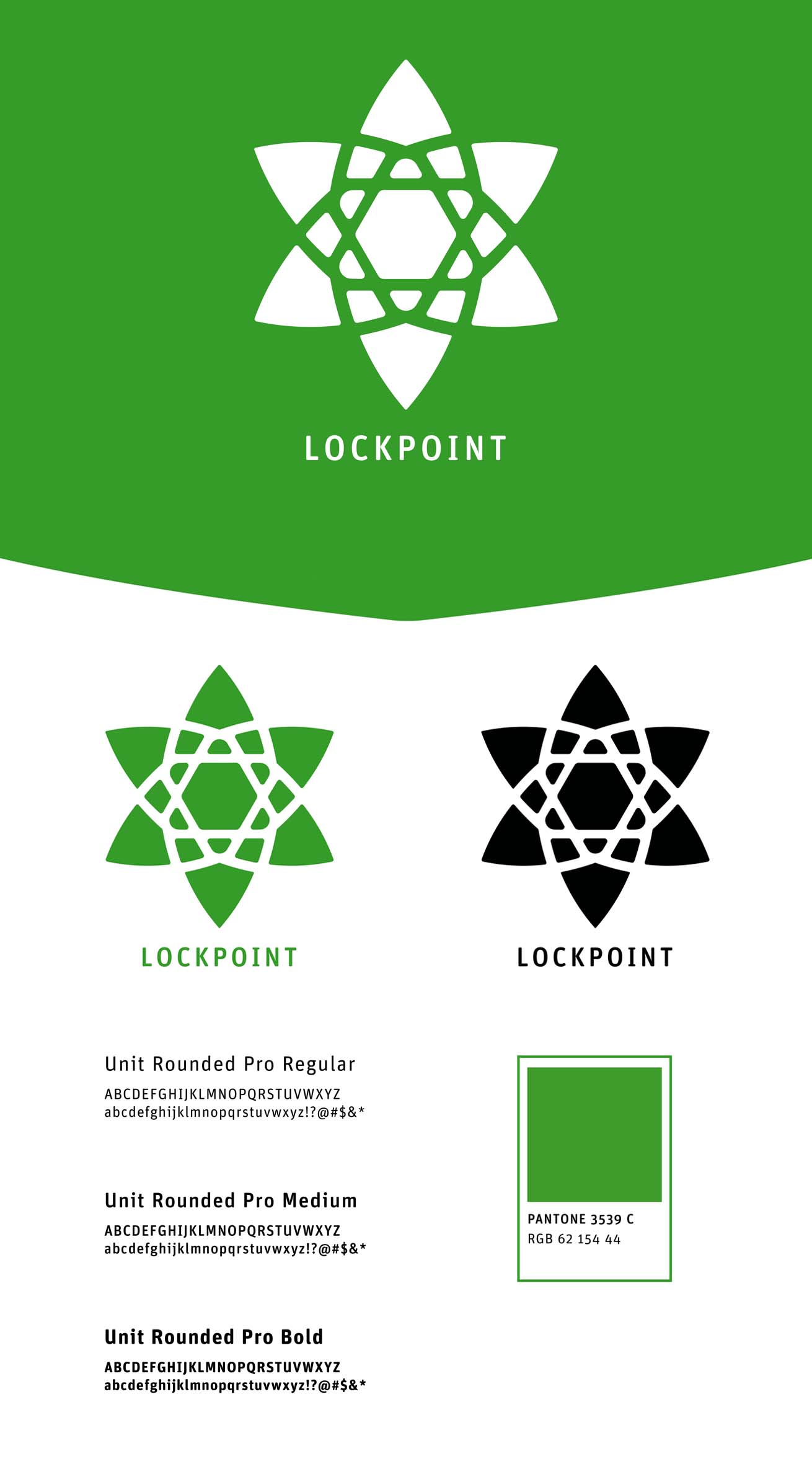
Lockpoint is a park identity I created. The park would replace the abandonments of a Wet N Wild Park in Lockpoint, Manitoba. The logo is a combination of a snowflake, star, and pine trees, all of which you can expect in the area. After illustrating my iconography, the next step was to establish a wayfinding system which included directional, interpretations, etc. It needed to be branded and legible.


Outcome
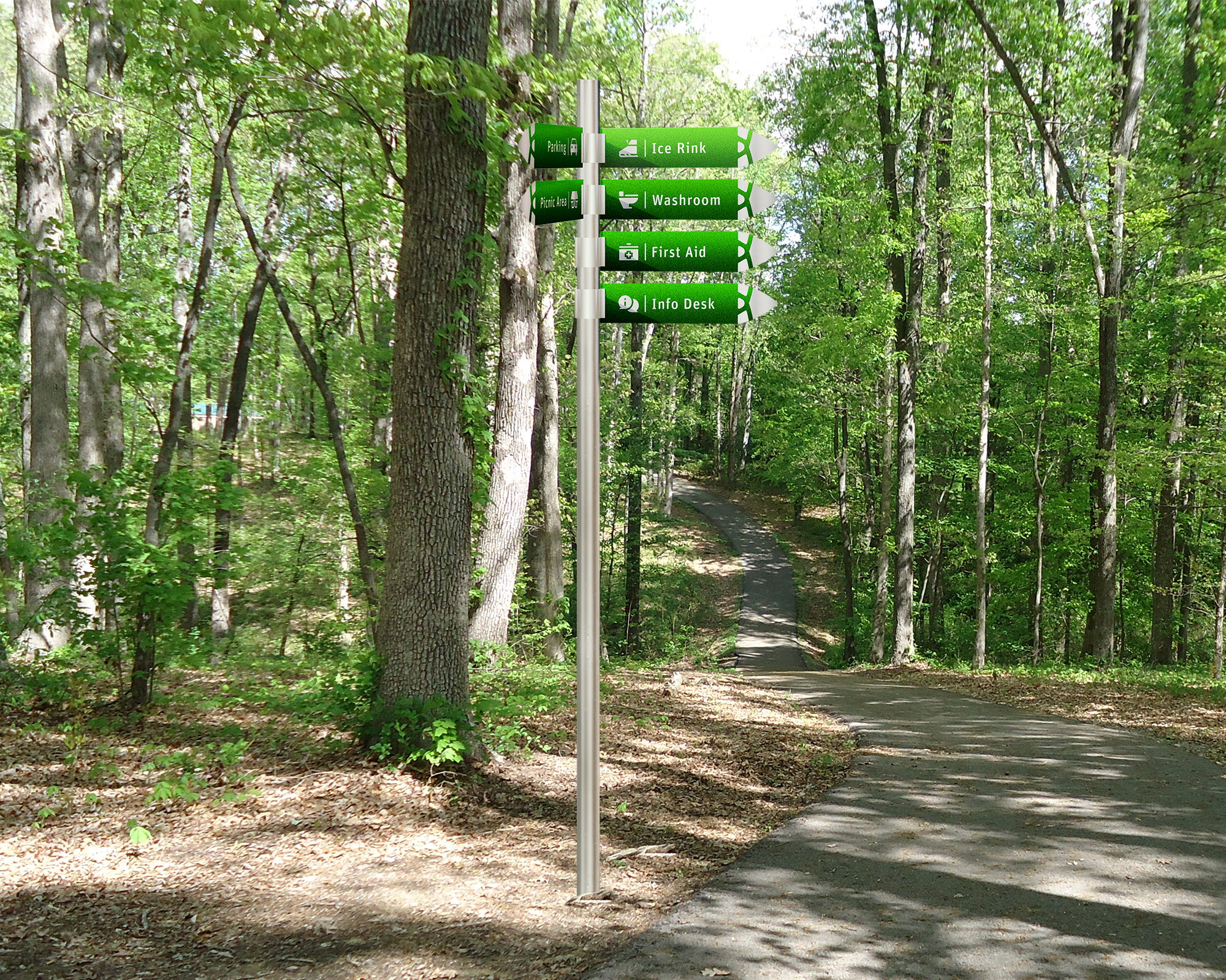
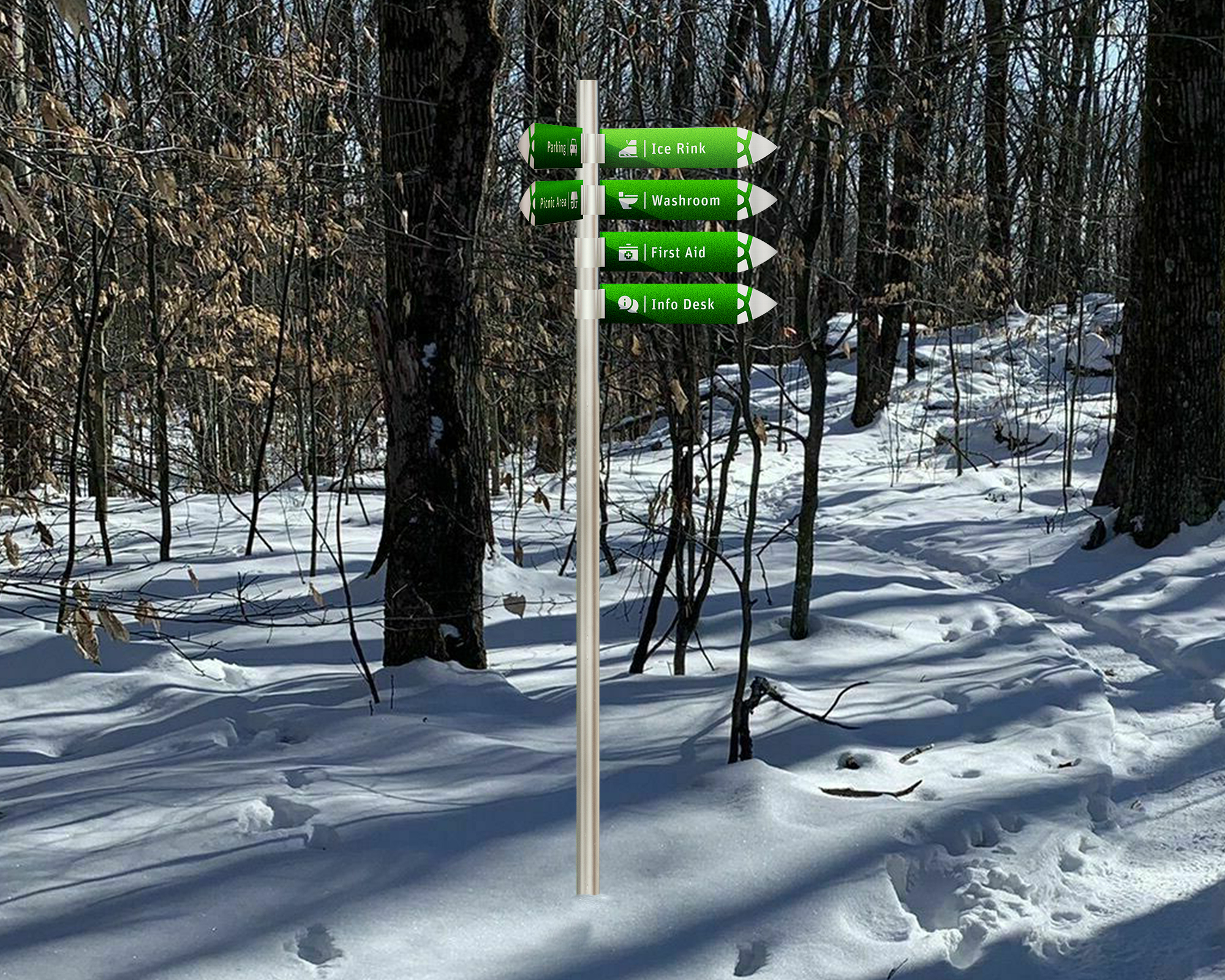
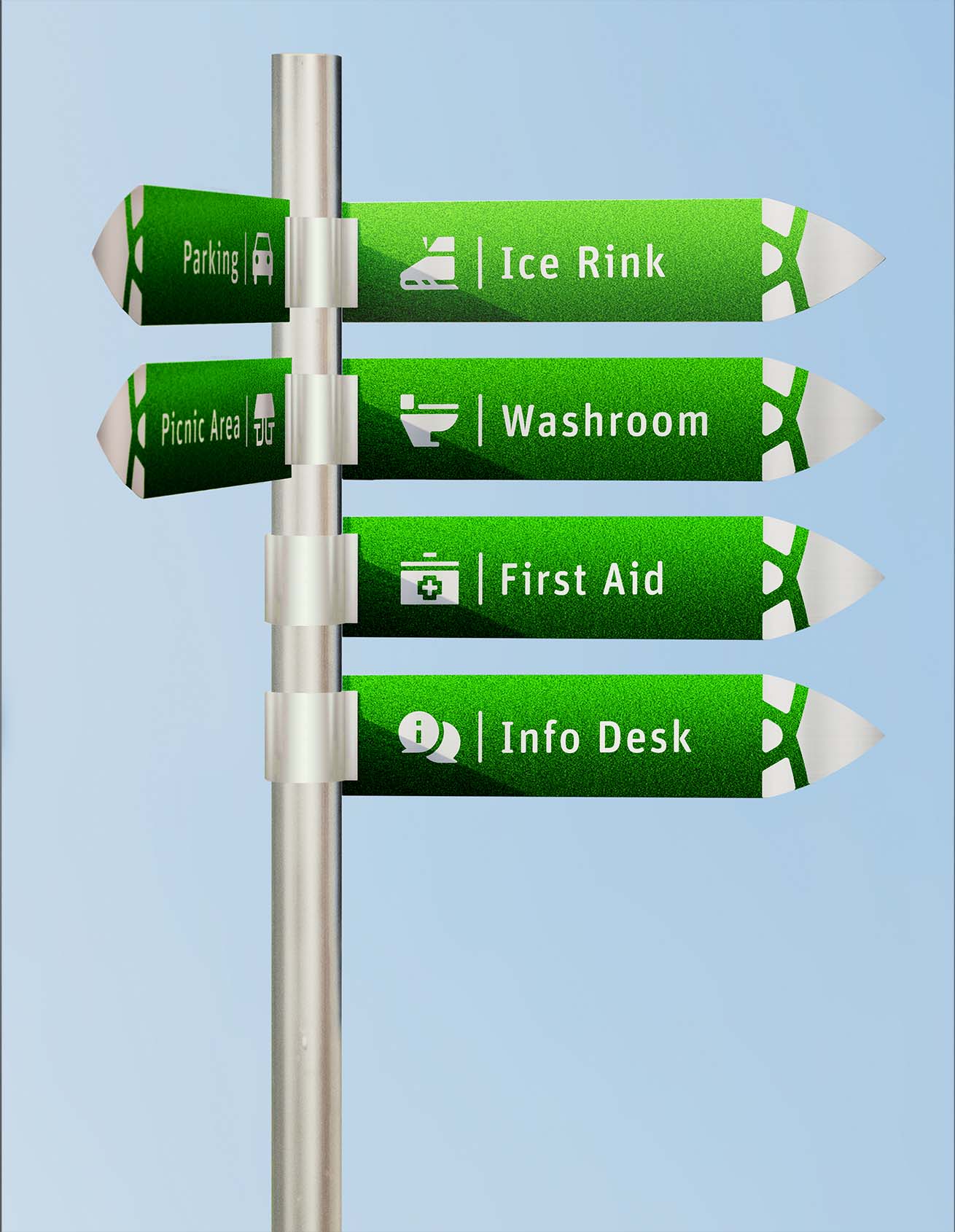
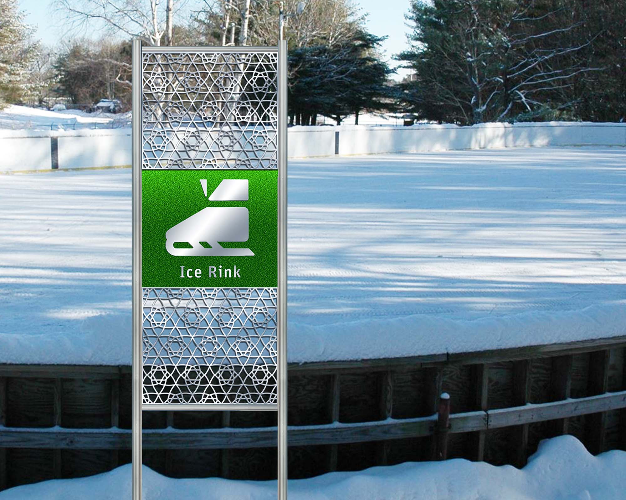
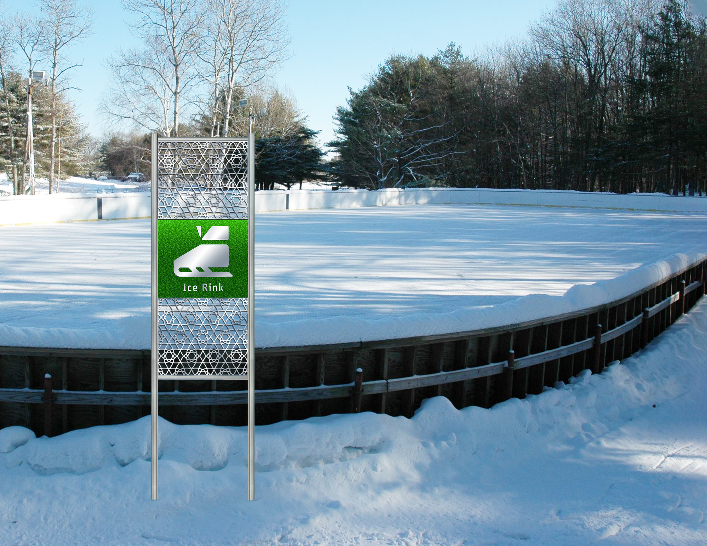
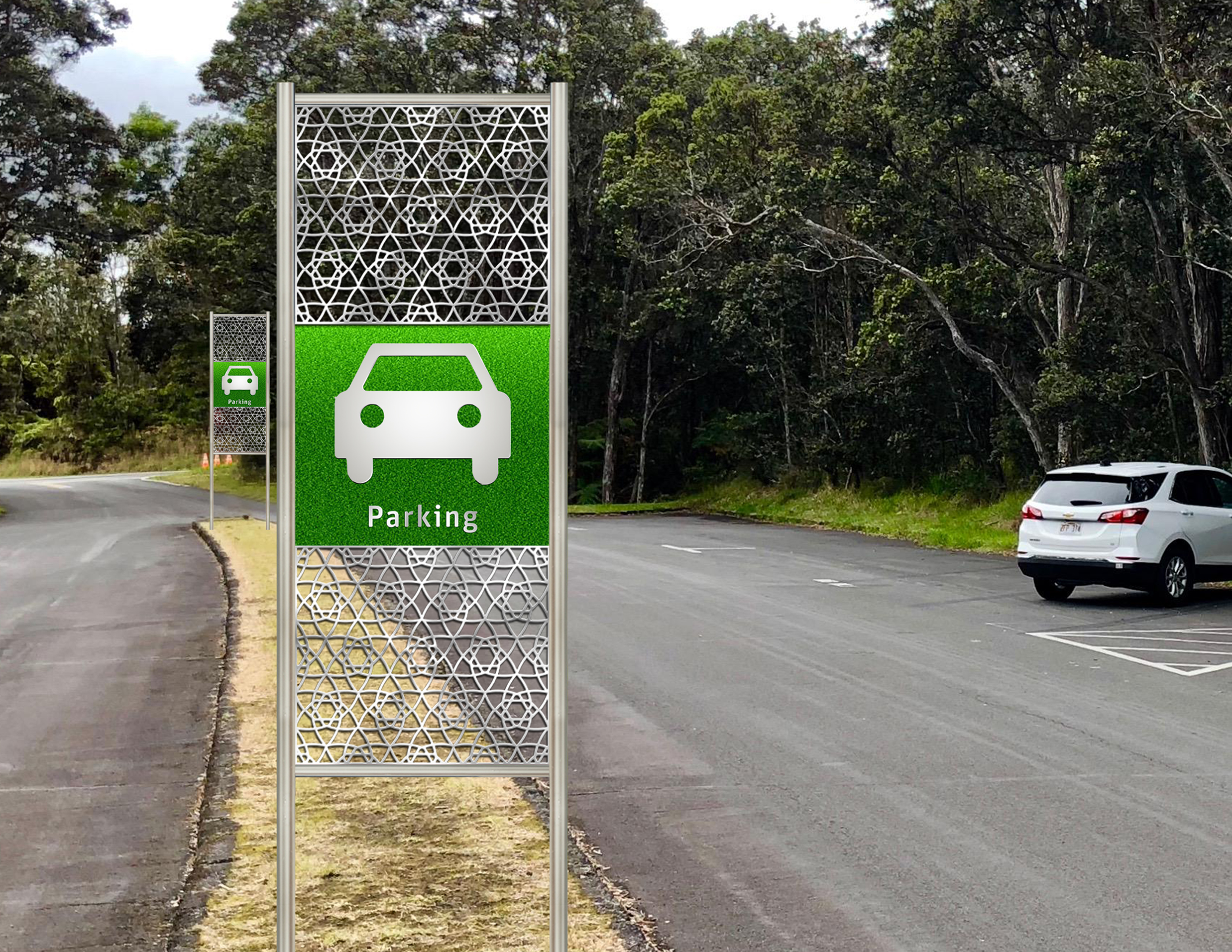
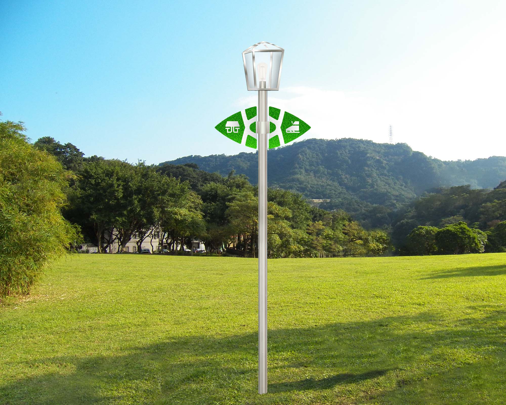
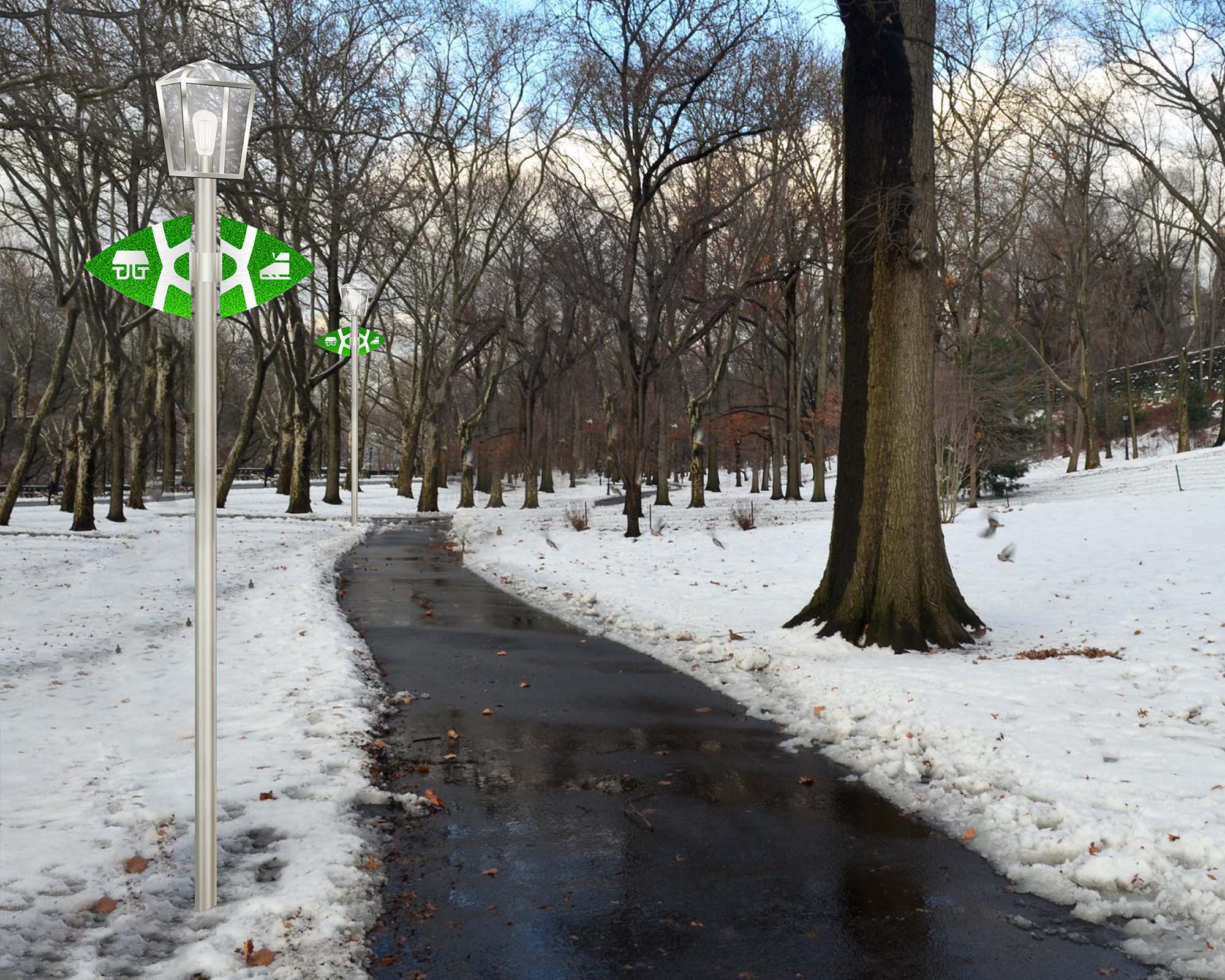
When designing directional signage, it was important to consider accessibility for the visually impaired, so I used a simple typeface and 2-colour palette. The signage was bevelled. In addition, iconography can be understood universally. The logo inspired a fence pattern and the shape of the directional arrows (pictured to the right). In summary, wayfinding is inclusive and must be comprehensible to anyone.




Lockpoint Park
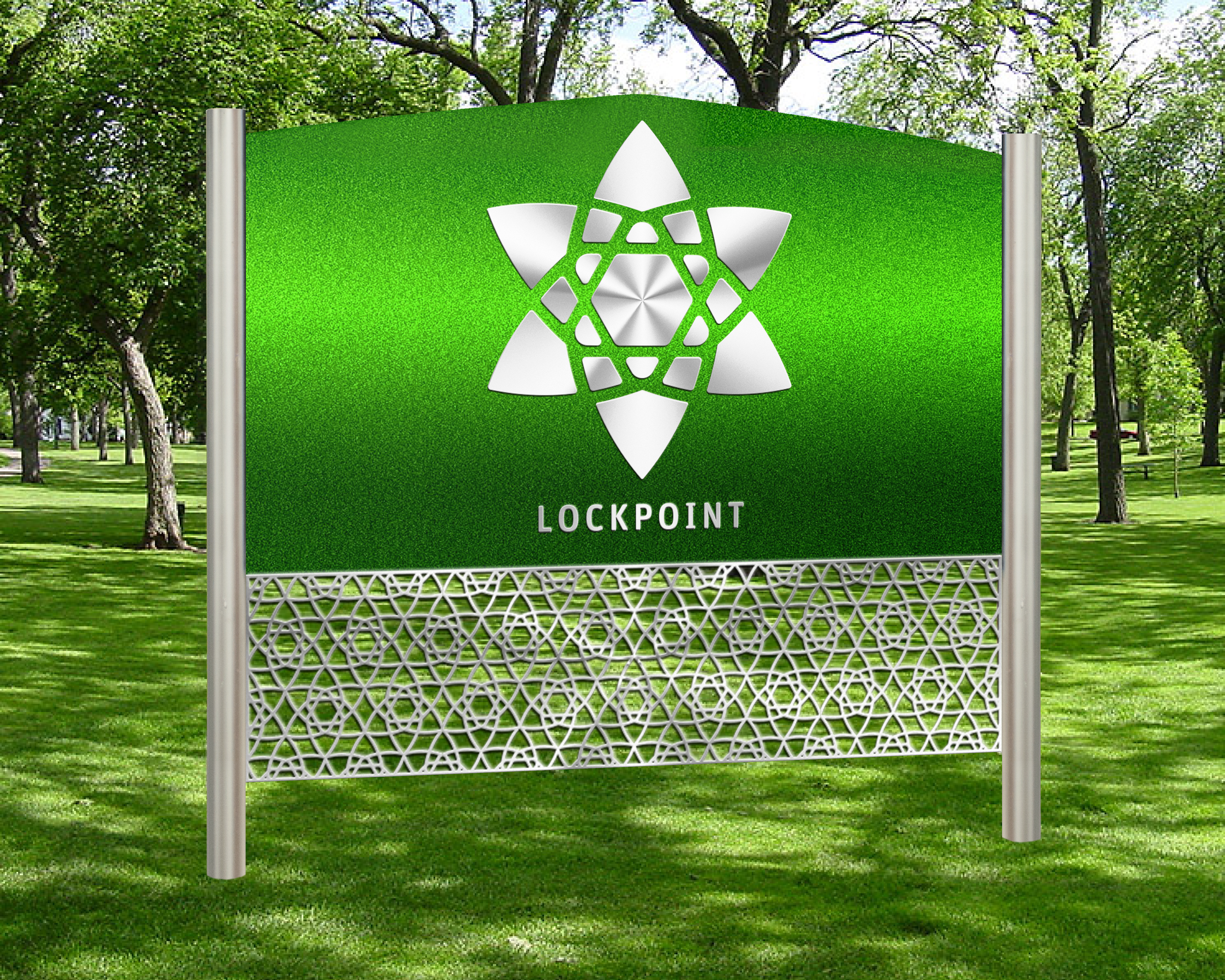
Lockpoint is a park identity I created. The park would replace the abandonments of a Wet N Wild Park in Lockpoint, Manitoba. The logo is a combination of a snowflake, star, and pine trees, all of which you can expect in the area. After illustrating my iconography, the next step was to establish a wayfinding system which included directional, interpretations, etc. It needed to be branded and legible.
Outcome
When designing directional signage, it was important to consider accessibility for the visually impaired, so I used a simple typeface and 2-colour palette. The signage was bevelled. In addition, iconography can be understood universally. The logo inspired a fence pattern and the shape of the directional arrows (pictured to the right). In summary, wayfinding is inclusive and must be comprehensible to anyone.
Identity
Iconography

Directional


Facilities
Trail Markers
Interpretational
