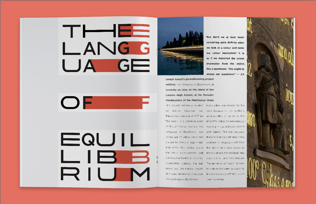




Joseph Kosuth Exhibition
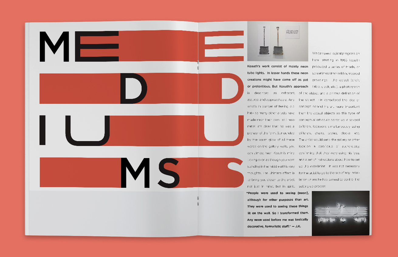
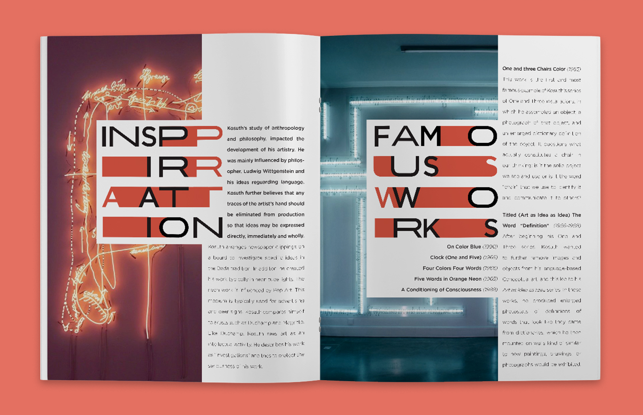
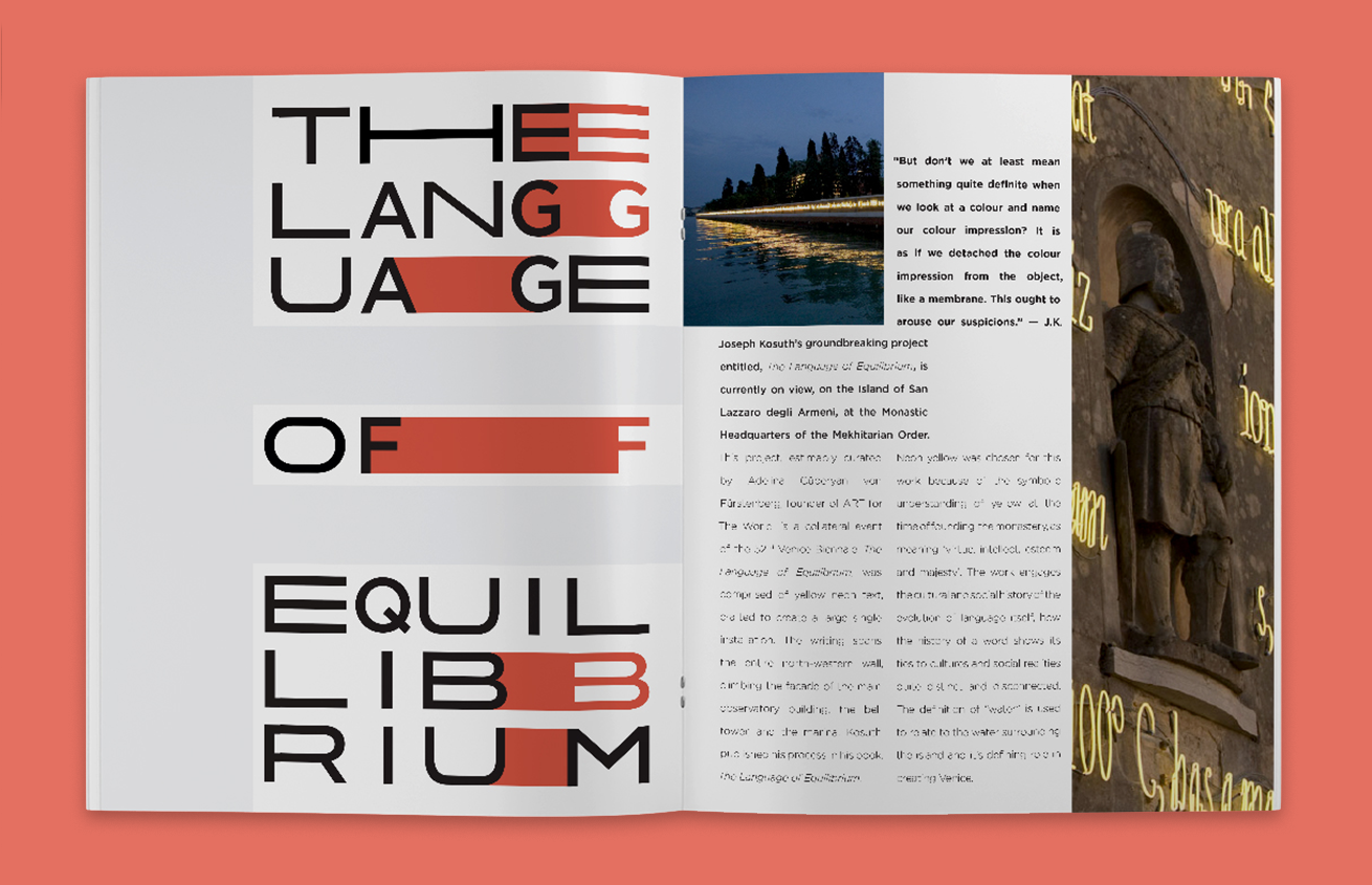
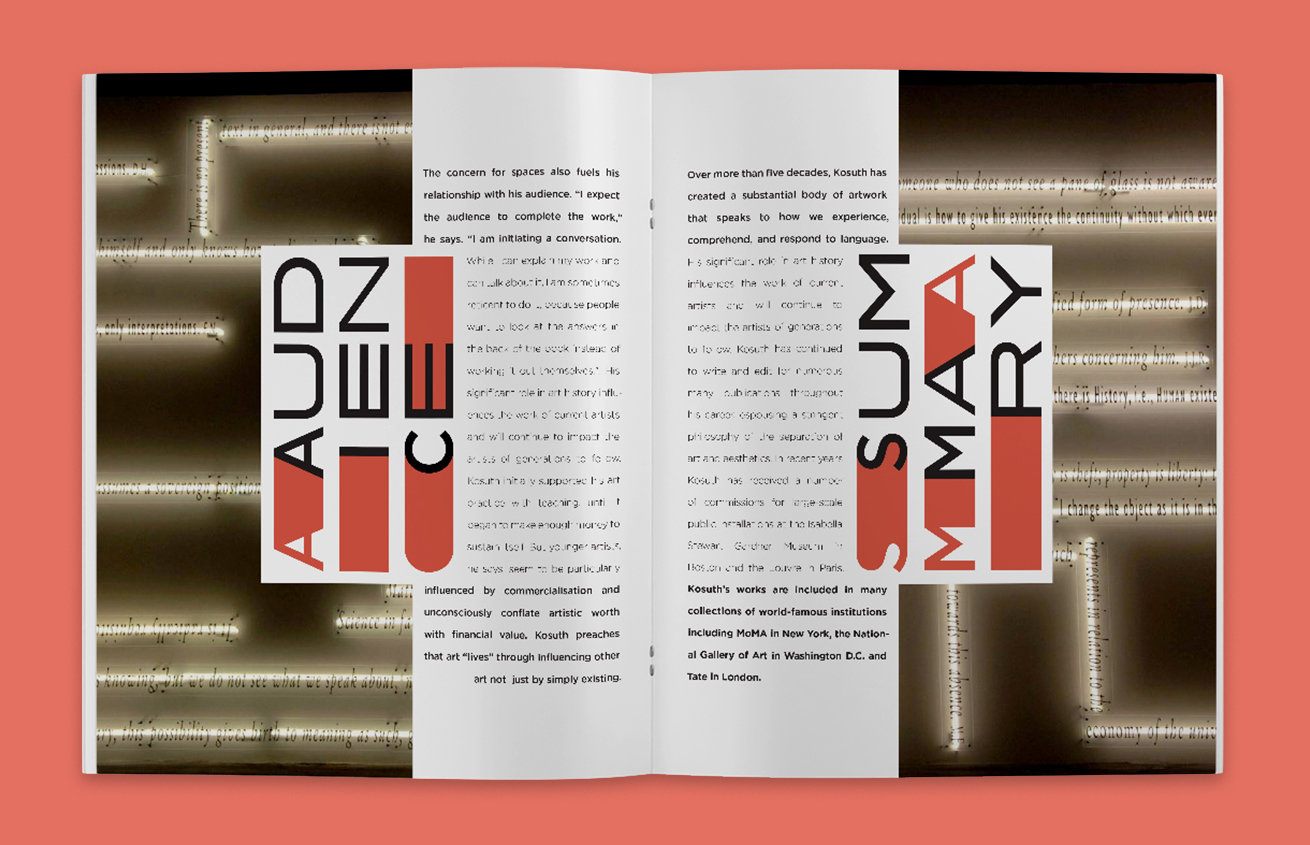
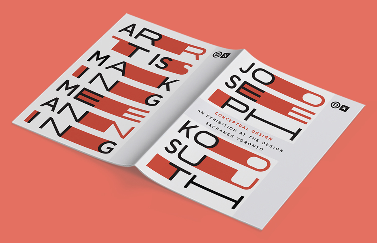
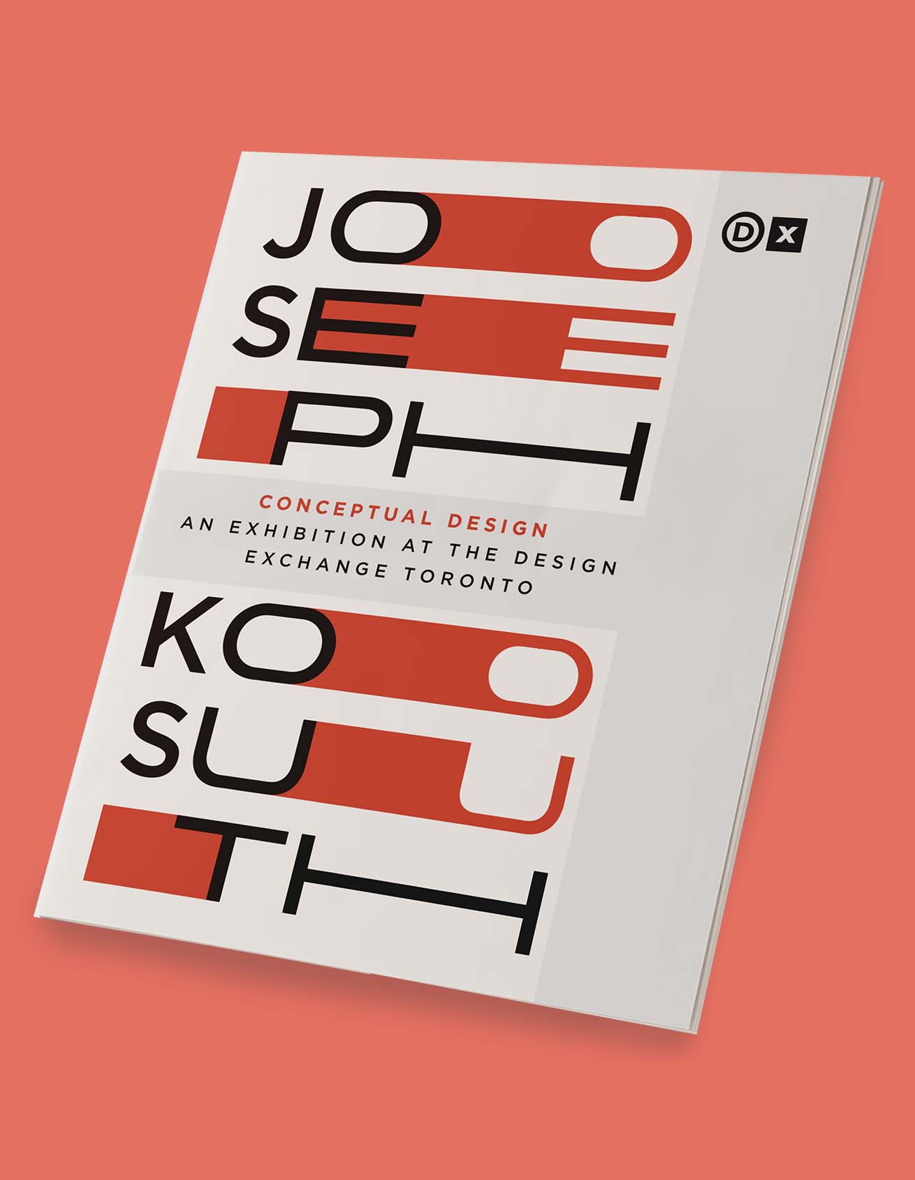
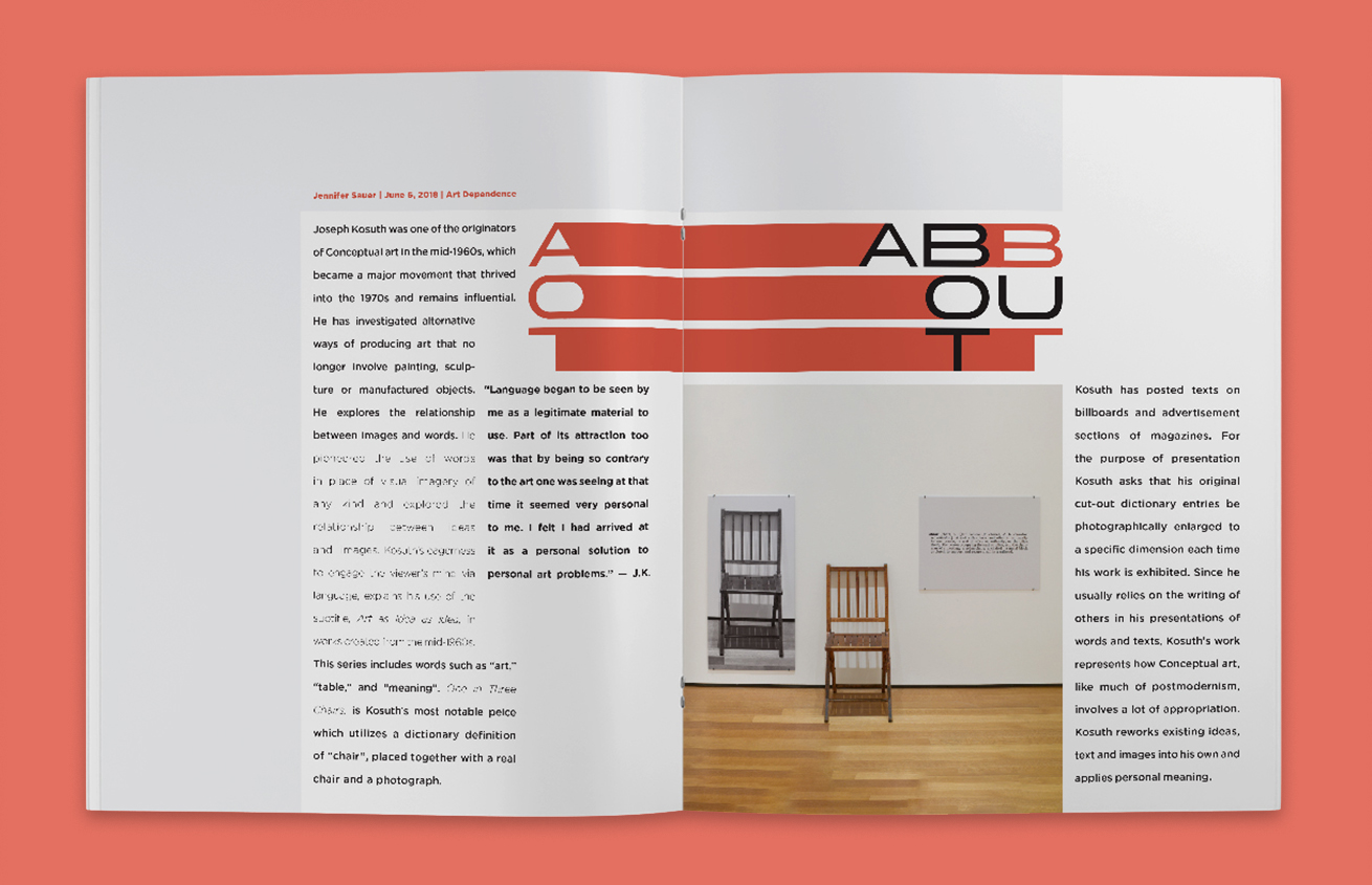
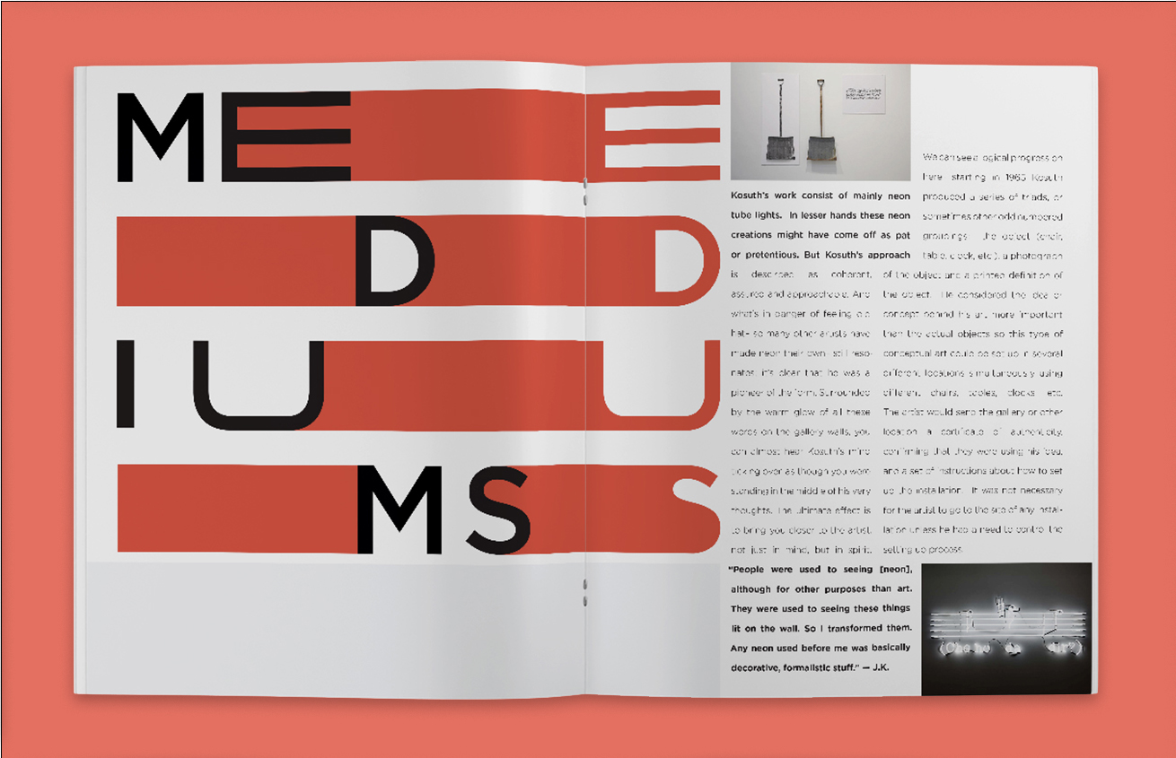
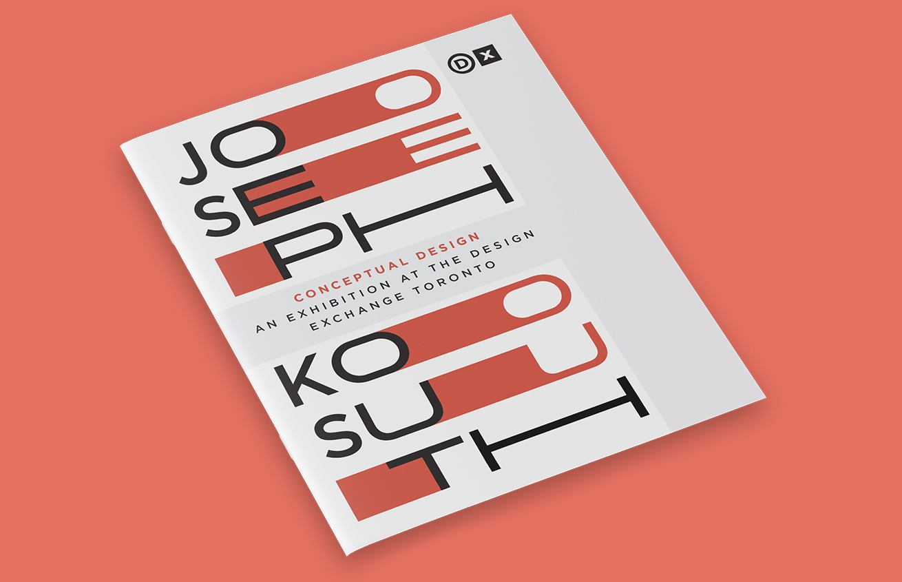
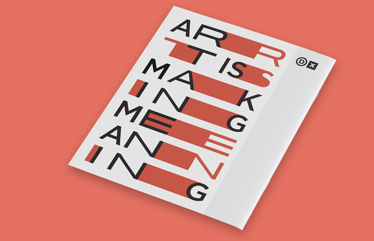
I designed an exhibition brochure for Joseph Kosuth. Kosuth is a conceptual artist that frequently pushes the boundaries of design and uses language as art. He was an ideal candidate since I have interest for typographic art and had previously viewed his work at the AGO. My goal was to create a design bold in its simplicity and sharpness. Photography was carefully selected to support the bodycopy.


Outcome
I used justified text to maintain a strict geometric grid and was able to integrate typographic art. I relied on a high contrast palette only using red, grey, and black. I combined my style with Joseph’s photographs to create a modern design that speaks to the artist. Joseph believes words are simply powerful, so in response I wanted the headers to be visually powerful in size and colour. Overall, it’s a clean design.





Joseph Kosuth Exhibition
I designed an exhibition brochure for Joseph Kosuth. Kosuth is a conceptual artist that frequently pushes the boundaries of design and uses language as art. He was an ideal candidate since I have interest for typographic art and had previously viewed his work at the AGO. My goal was to create a design bold in its simplicity and sharpness. Photography was carefully selected to support the heavy bodycopy.
Outcome
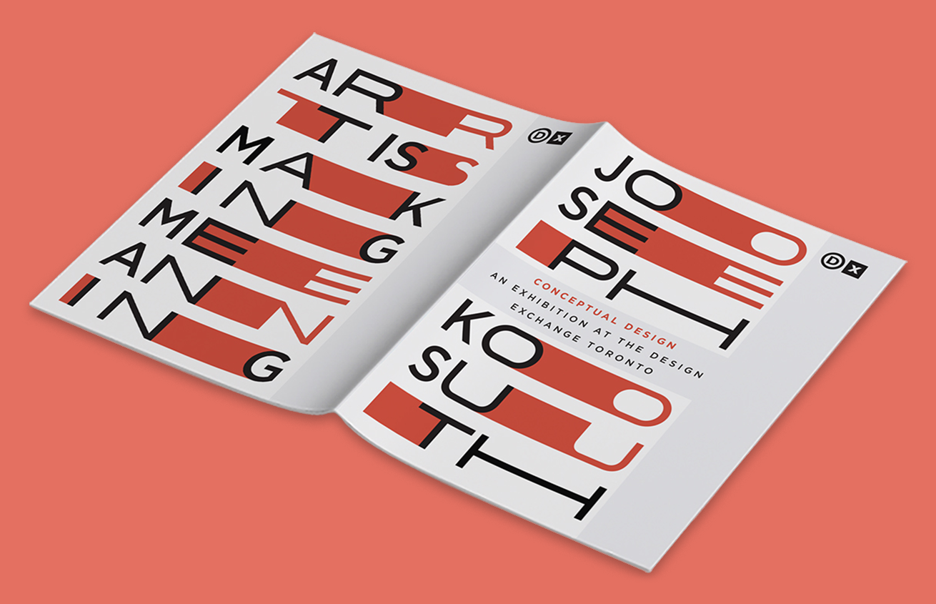
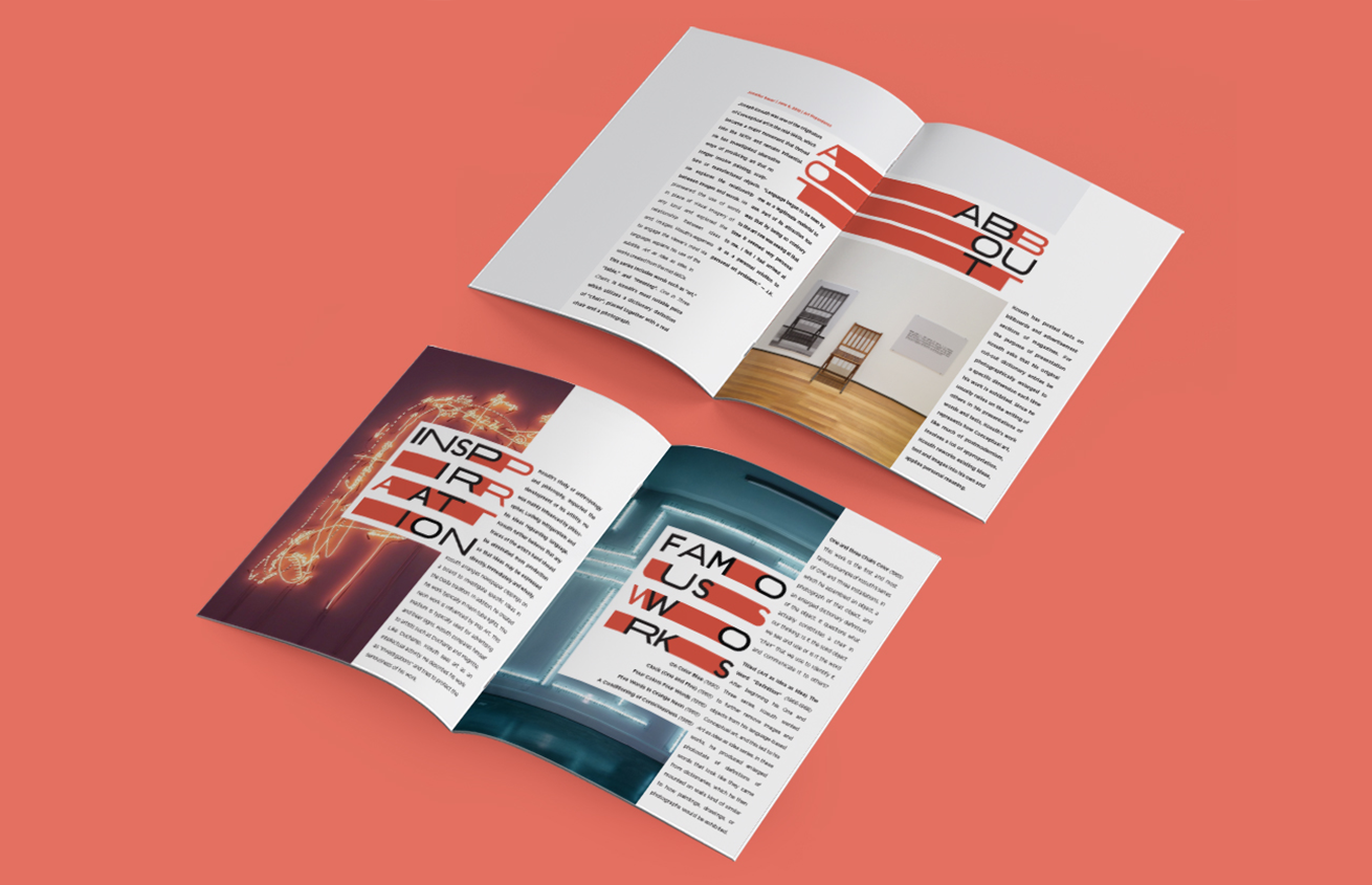
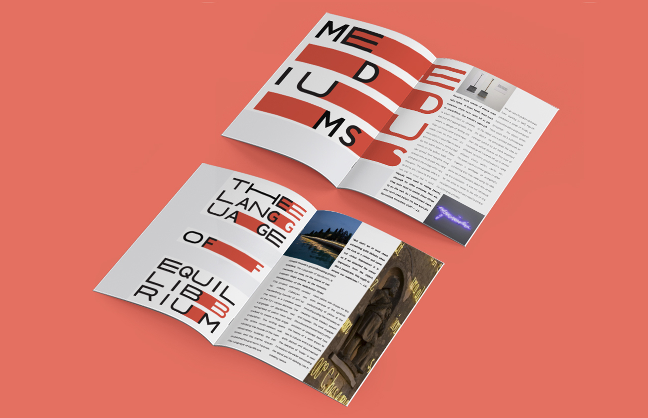
I used justified text to maintain a strict geometric grid and was able to integrate typographic art. I relied on a high contrast palette only using red, grey, and black. I combined my style with Joseph’s photographs to create a modern design that speaks to the artist. Joseph believes words are simply powerful, so in response I wanted the headers to be visually powerful in size and colour.
Front & Back
Spreads Up-Close

